
Goals of the Non-Linear Journey
Scale Without Lengthening
Introduce new categories and services without making the customer’s journey longer—ensuring the product remains scalable.Improve Attach Rate
Increase the percentage of customers who add value-added services during their car purchase.Personalize the Experience
Surface options and services tailored to each customer’s needs and profile.
My Role
I owned the end-to-end design and architecture of a flexible, scalable journey. This included:
Collaborating with PMs and stakeholders to pinpoint the right problem.
Crafting wireframes and UI designs within our design system.
Coordinating with developers for a smooth hand-off and rapid release.
Monitoring A/B test results and using insights to drive further improvements.
Hypotheses
“I don’t know the benefits of these car services.”
“I don’t have time to explore every plan—I only care about what I need.”
“I’m used to having someone guide me to choose these services.”
“I only care about how these services benefit my car, not browsing everything.”
Discovery & Pain Points
During discovery, I dug into customer behavior to pinpoint where a non-linear journey could fall short:
Hidden Options: Some service plans go unnoticed because users only interact with a subset of offerings.
Required vs. Optional Confusion: Customers can’t tell which add-ons are mandatory and which are extras.
Scroll Fatigue: Balancing vertical and horizontal scrolling can overwhelm users, leading them to drop off.
Brainstorming Solution Ideas
Personalized Experience
Surface only the services that matter most to each customer, based on their car model, browsing history, and profile.Embedded Touchpoints
Integrate brief VAS callouts within car detail pages—so users learn about tinting, warranty, or coating at the moment they’re researching a car.Benefit-Driven Banners
Use concise banners to highlight key advantages (e.g., “Protect your paint from scratches” or “Extend engine life by 2 years”) right where users expect them.Visual Previews
Show high-quality mockups of cars with tinting or coating applied—letting customers “see before they buy” and boosting confidence.

Design Options & Selection
After presenting the initial sketches, we aligned on two wireframe directions. I then fleshed out detailed mockups for both options, ready for user feedback and A/B testing.

Option 1 in details

Option 2 in details
Non Linear Flow chart

Mood board Inspiration


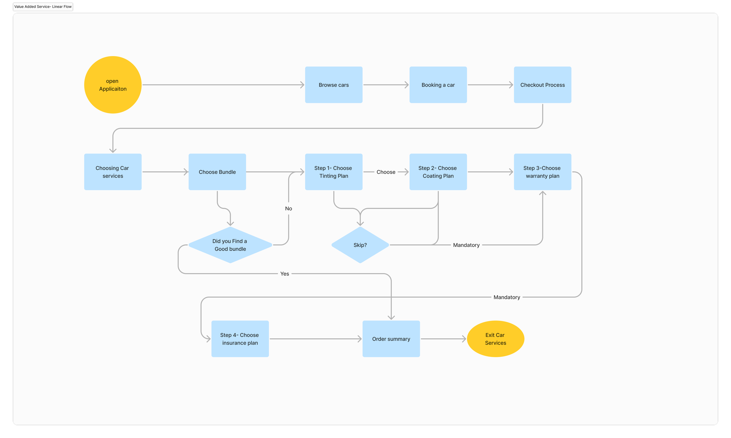
Linear Version UI ( Old Designs )

Main anchor page UI exploration

Non-Linear Flow ( Final UI Designs )


Results
Immediate Attach-Rate Uplift
Once the non-linear flow went live, we saw a clear uptick in the percentage of users adding services—proof that surfacing relevant options early pays off.Early Margin Impact
This initial boost is just phase one. As we continue refining and rolling out to all users, we expect a significant positive shift in overall revenue margins.User Confidence & Independence
Fewer users needed to call support or wait for guidance—meaning we reduced RM hand-holding and empowered customers to make choices on their own.
