
Summary
When I joined this project at Cars24, the MVP for car services was already live, but it wasn’t working. Users were confused, drop-off rates were high, and the flow felt more like a placeholder than a proper experience.
The idea was promising: let customers add services like tinting, warranty, or ceramic coating while buying their dream car. But the execution lacked clarity and trust.
My mission was clear:
✅ Make it user-first
✅ Eliminate friction
✅ Help the product sell itself
After redesigning the experience based on user insights, we saw:
11% increase in service revenue
Clear improvement in engagement and user understanding
I led the research and design efforts, combining qualitative interviews, field visits, and survey data to identify what truly mattered to users.
Redesign Goals
Improve the attach rate (more users choosing services with car purchase)
Make the digital journey feel as helpful as the in-store experience
Show only what the user cares about, no fluff
Hypotheses (What we believed users think)
“I don’t really know what these car service bundles offer.”
“I don’t want surprise costs — show me service options while I’m browsing.”
“I don’t have time to explore every option — just help me choose what fits.”
“I’m used to having someone guide me through this.”
“When I visit showrooms, I see similar cars already tinted or coated — that helps me decide.”
“If I have questions about tinting or coating, I want clear answers — not marketing fluff.”
“I need to know exactly what coating does and why it’s worth it.”
Key Problems We Identified
We collected user pain points across different sources:
→ NPS feedback, direct interviews, and field visits.
Top Frustrations:
“I don’t get proper help from my Relationship Manager. They’re slow, and support basically disappears after delivery.”
“I don’t know how to apply for car financing — it’s confusing.”
“The whole process around registration, delivery, and documents is unclear. I don’t know what to expect at the RTA.”
“Nobody told me that insurance only covers non-agency repairs — it should be crystal clear.”
“I had no idea what the warranty actually covered — that should’ve been explained.”
“The car didn’t arrive on the day I was promised.” (This was handled separately.)


Brainstorming & Key Suggestions
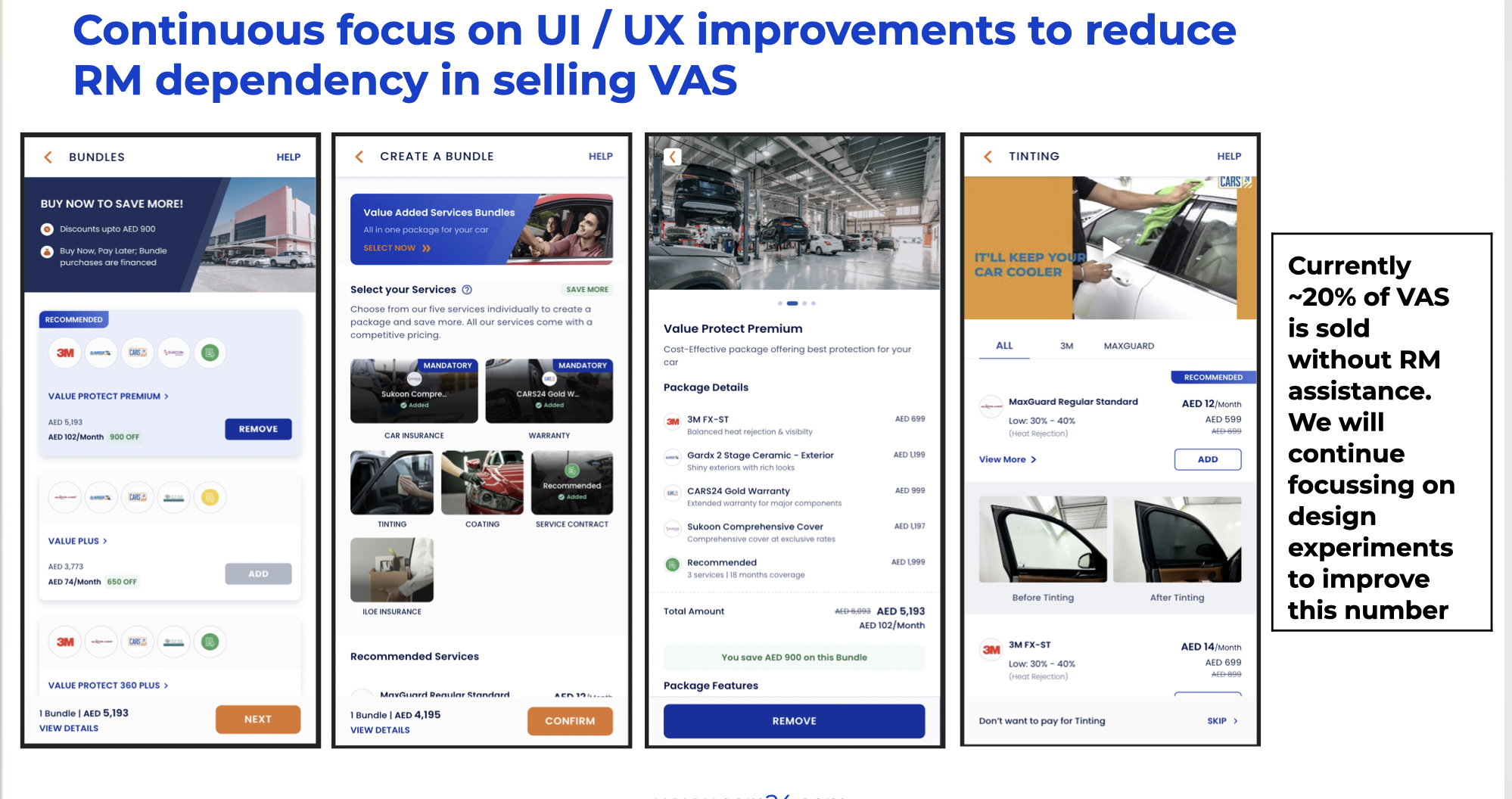
One of the core challenges was reducing users’ dependency on Relationship Managers (RMs) to understand Value-Added Services (VAS), and instead, empowering them to self-select services directly from the app.
The Problem:
Currently, the first time a user learns about VAS (like tinting, warranty, or coating) is during a call with the RM — after they’ve already paid a token and committed. That’s too late in the journey. We wanted to shift this upstream.
A new process was proposed: let Delivery Advisors pitch VAS right after the token placement inside the app — giving users control and clarity early.
What we learned from top-performing RMs:
Some RMs consistently closed more VAS deals. We studied what they did right — and found several behaviors we could build into the product:
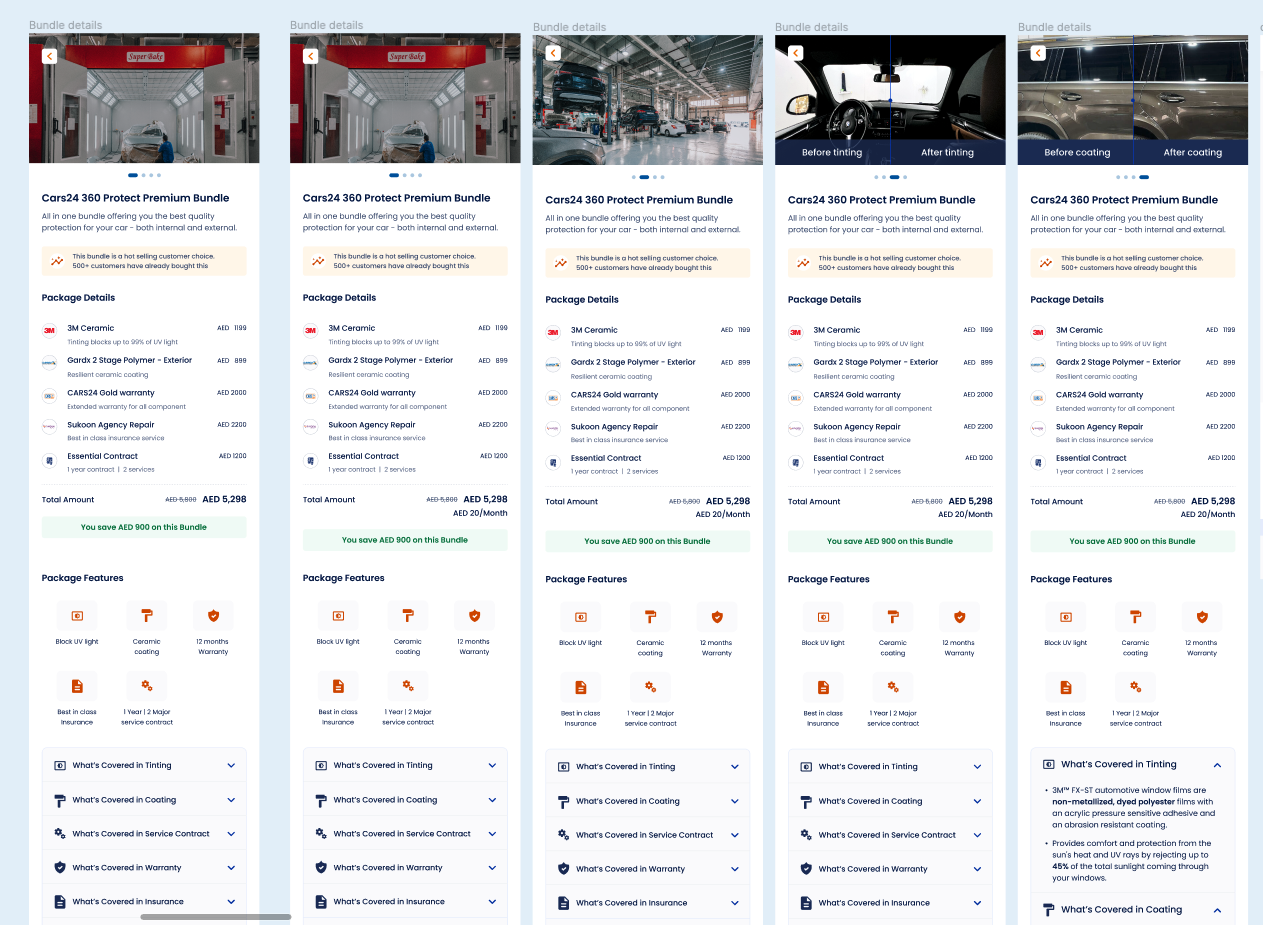
They always sent brochures or images over WhatsApp.
Visuals made it easier for users to understand value — especially for tinting and warranty.👉 Takeaway: These same visuals and breakdowns should exist inside the product.
Common Questions Users Had (based on RM calls):
Tinting:
“How will my car look with this tint?”
“What’s the difference between brand A vs B?”
“What do 30% vs 50% darkness levels look like?”
“Is there a warranty?”
Warranty:
“Are engine or AC parts included?”
“Will parts be replaced or just repaired?”
Coating:
“Will scratches still be visible?”
“How much protection does it actually offer?”
RM Selling Techniques Worth Adopting:
Personalized Pitches
Good RMs adjusted their message based on:User profile: price-conscious vs premium
Car type: compact, SUV, luxury
Social Proof
When a user hesitated, many RMs used this line:“My last 3 customers with similar cars all added coating.”
👉 This technique works. Let’s integrate it into the product as part of the content strategy
Insights from Data

Designs Ideas


Old Version Designs
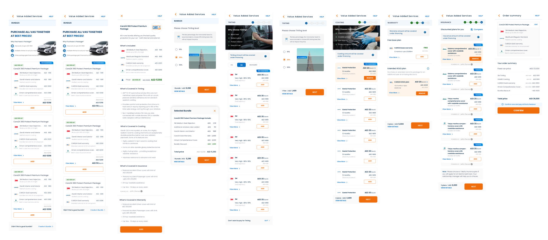
Bundle List UI Exploration

Final Designs


Live view after Developing
Results & A/B Testing
After testing multiple design options with real users, we saw clear results — not just in usability, but in business impact as well.
The redesigned experience helped:
Simplify the service selection process
Build user confidence
Increase early-stage engagement with VAS
Through A/B testing, we validated that:
Users engaged more with clearer, visual explanations
More users completed their journey without needing RM support
And most importantly — revenue margins increased by ~11%
This proved that user-centered design directly impacted business growth — not by making things flashy, but by making them easier to understand and act on.

A/B Test Results
We ran an A/B test to compare the new experience against the existing one.
Here’s what we found:
The new bundle layout showed a +1.2% improvement in attach rate — a small but meaningful uplift.
For individual services like tinting, coating, and warranty, the performance remained mostly the same.
Even though the differences weren’t massive across the board, the test confirmed that:
The new design didn’t harm performance (which is always a risk when redesigning)
Bundling services with clearer layout and messaging nudged more users to take action
And with more users completing the journey independently, the design supported our goal of reducing RM dependency.
