I stopped designing a feature, and started designing a conversation.
An exploration into a question every banking app gets wrong: "How was my spending last month?" Most answer it with a wall of text. I wanted to find out what happens when the interface itself becomes the answer, and then I coded it to prove the feel was real, not staged.
The premise
I kept noticing the same failure across AI banking assistants. You ask a human question, "how was my spending?", and you get a robotic answer: a dense paragraph, or worse, a dashboard crammed into a chat bubble. Both treat the question as a query to be answered and closed.
But that's not how people think about their money. The question isn't a database lookup. It's the opening line of a conversation someone is a little anxious to have. So I set myself a constraint before I drew anything:
Most banking apps treat "how was my spending?" as a query to be answered. I wanted to treat it as a conversation to be opened.
That single reframing decided everything downstream, the layout, the tone, the pacing, even the platform.
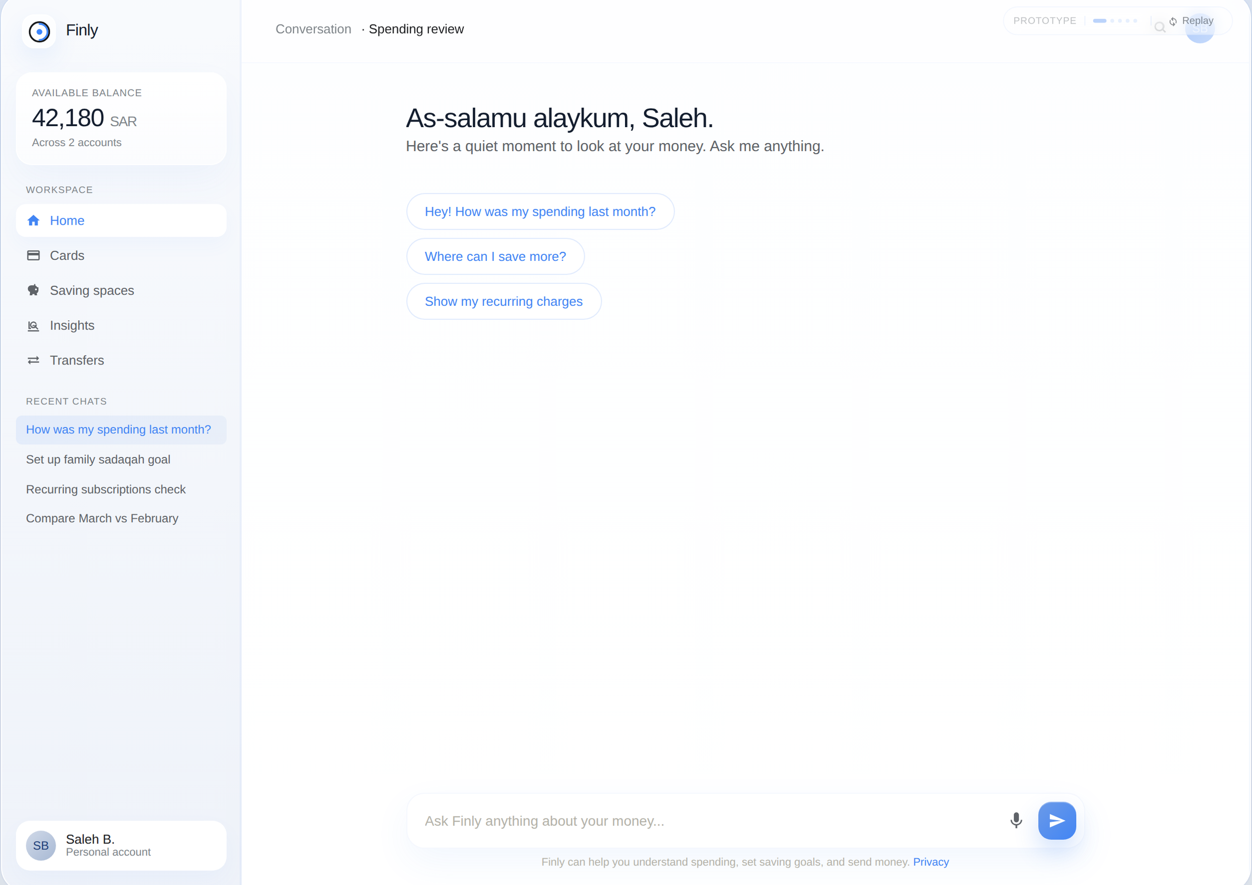
The resting state. Quiet on purpose. A conversation opens calmly, it doesn't greet you with twelve widgets.
Why the gap existed
Before designing, I studied who had already attempted this. The market had sorted itself into two camps, and neither was wrong, exactly. They were each half-right.
The dashboard camp
Revolut, Wio, Liv. Beautiful analytics. But the user does all the interpretive work. Numbers, no judgment. You leave knowing what you spent, not whether you should feel okay about it.
The chat camp
Cleo, Capital One's Eno. Warm, conversational, good at nudging. But visually flat, you read about your money instead of seeing it. Depth gets flattened into sentences.
The gap between them wasn't unclaimed by accident. Combining them is genuinely hard: visual richness usually means a dashboard, and a dashboard kills the conversational feel. The interesting problem was holding both at once, depth that lives inside the conversation instead of replacing it. That tension became the whole project.
One question, three people
The same five words hide three completely different emotional needs. In a GCC context, shaped by monthly salary cycles, family remittances, and Ramadan and Eid spikes, I mapped them as three people:
The optimizer
"Did I do better than last month?" Wants the trend and the next move. Impatient with hand-holding.
The provider
"Is the family on track?" Wants reassurance the budget held, immediately, without digging.
The learner
"Where did my money even go?" Wants plain language and permission to not feel ashamed.
This was the hardest design problem in the project: one bubble had to answer all three, without becoming three products.
The optimizer wants to drill in instantly. The learner needs to be told gently before being shown a single number. Build three separate flows and you've built three products to maintain. My answer was progressive disclosure inside one conversational bubble: open with the calmest framing everyone can absorb in two seconds ("a calmer month, alhamdulillah"), then offer depth as an invitation, never a requirement. Nobody is pushed past their comfort level, nobody is locked out of going deeper.
The decisions I defend
I designed for web, when everyone designs mobile
The instinct for a chat experience is mobile, it's the "natural" home for conversation. I went the other way on purpose. Web gave me side panels, multi-column layouts, and room for richer visualization without crushing the chat into a narrow column. The trade-off was real: I gave up the intimacy and thumb-reach of mobile. I judged that the depth-inside-conversation idea needed the canvas more than it needed the pocket. That's a defensible call, not a default one.
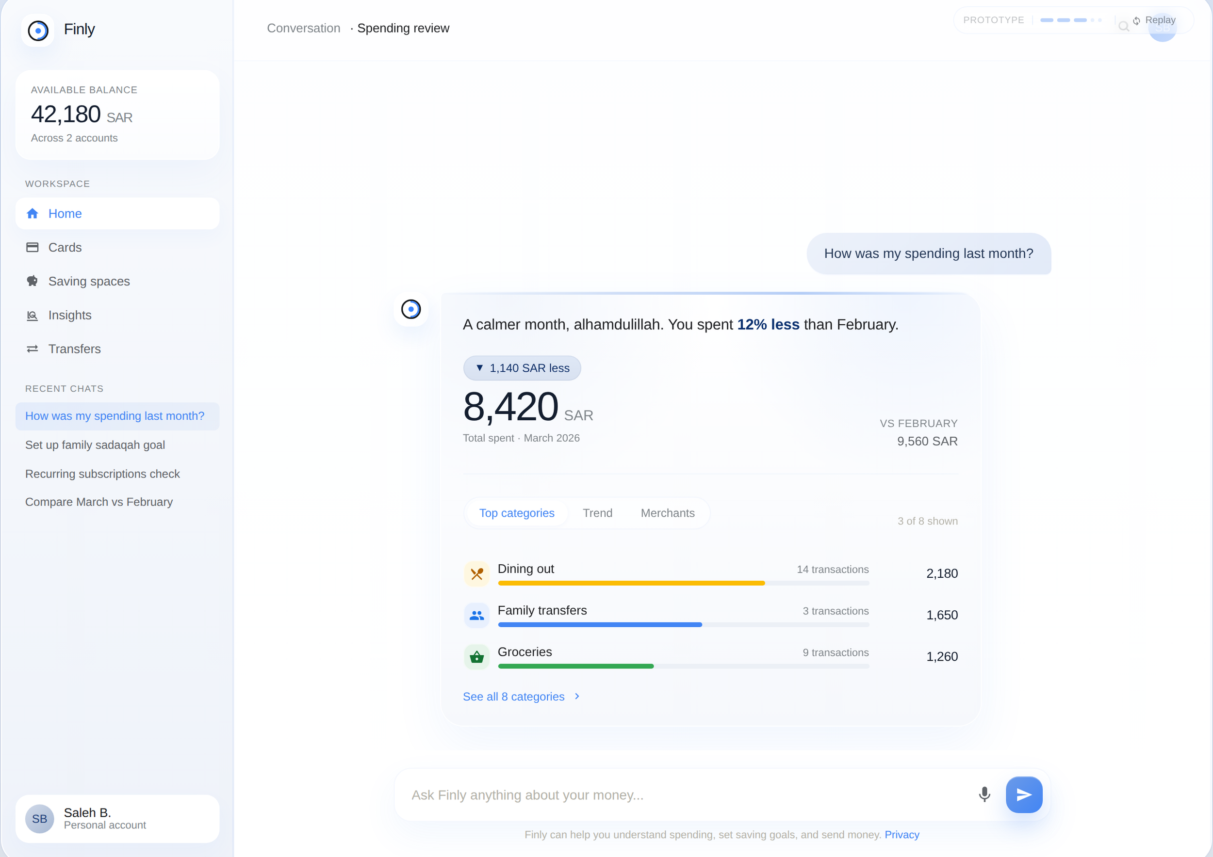
The answer isn't a paragraph. It's a living summary, headline, comparison, and category breakdown, all inside the conversation, never pasted beside it.
The drill-down is a layer, not a destination
Tapping a category doesn't navigate away. The panel reflows in place: merchants, trend, recommended actions appear beside the thread without ever losing it. The chat stays the spine. The data is a layer on top, not a room you leave the conversation to enter. That was the literal embodiment of the POV, the conversation is never closed.
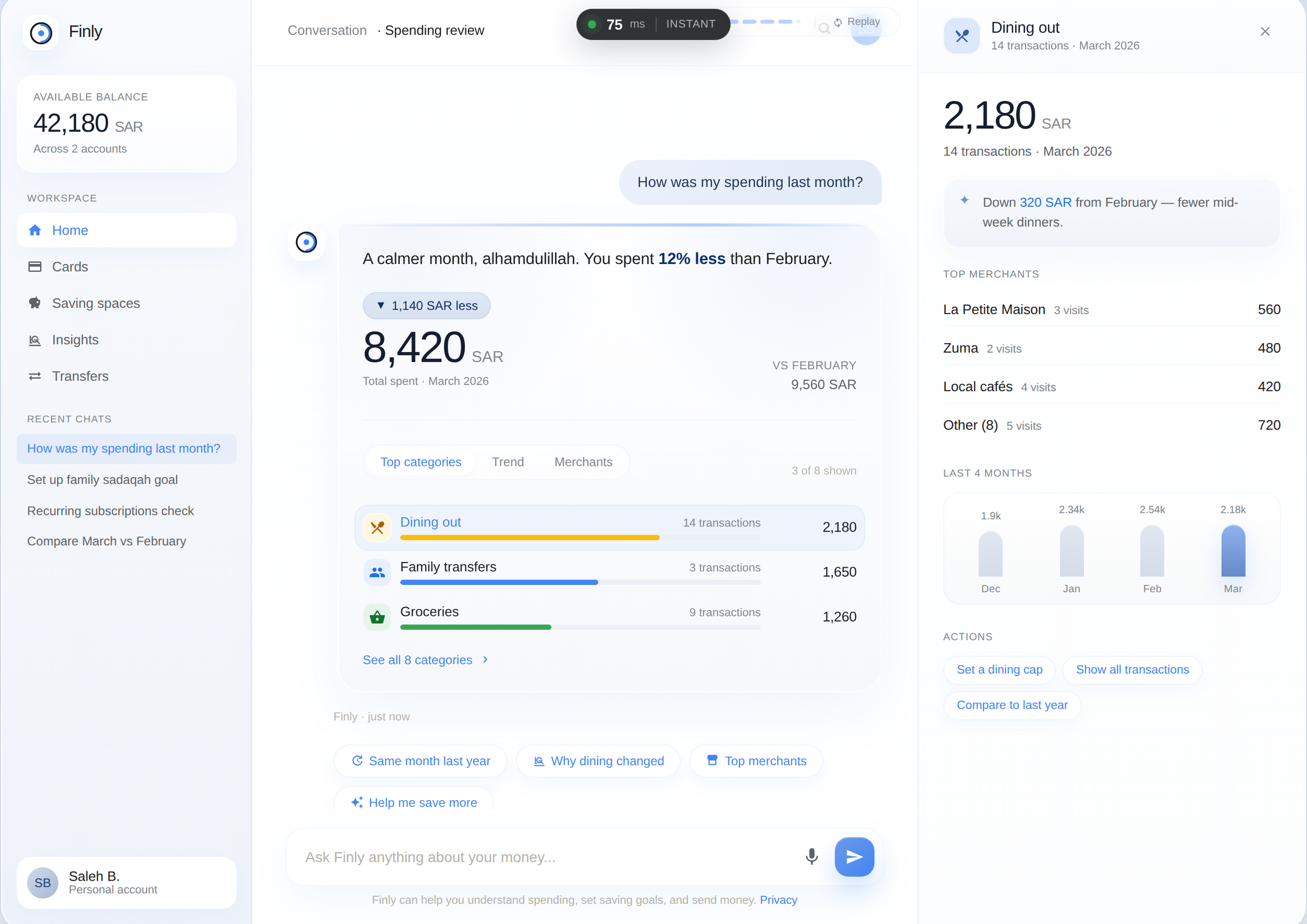
Tap a category and detail opens beside the conversation. The counter at the top is real, it measures actual time from tap to painted frame.
I coded it because a mockup can't prove a feeling
A Figma prototype can show what fast looks like. It can't prove it feels fast, it's a recording of a feeling, not the feeling itself. So I built the whole thing in vanilla JS and HTML, zero libraries, and instrumented it with a live latency counter that measures real time from tap to rendered frame using performance.now() and a double requestAnimationFrame.
Google's RAIL model sets the bar for an interaction to feel instant at 100ms. Past it, the link between action and reaction quietly loosens, and in a money app, that hesitation doesn't read as patience. It reads as anxiety. Speed here isn't polish. It's trust, expressed in milliseconds. Measuring it instead of guessing is the only reason I can say I hit the bar rather than hope I did.
The suggestion has to be earned
The app only offers something proactive, a small round-up savings habit, after the user has understood their spending. Never before. And it's framed as optional and Sharia-aware, with an equally easy way to dismiss it. A nudge before comprehension is a sales pitch. A nudge after understanding is a service. The ordering was the entire ethical decision.
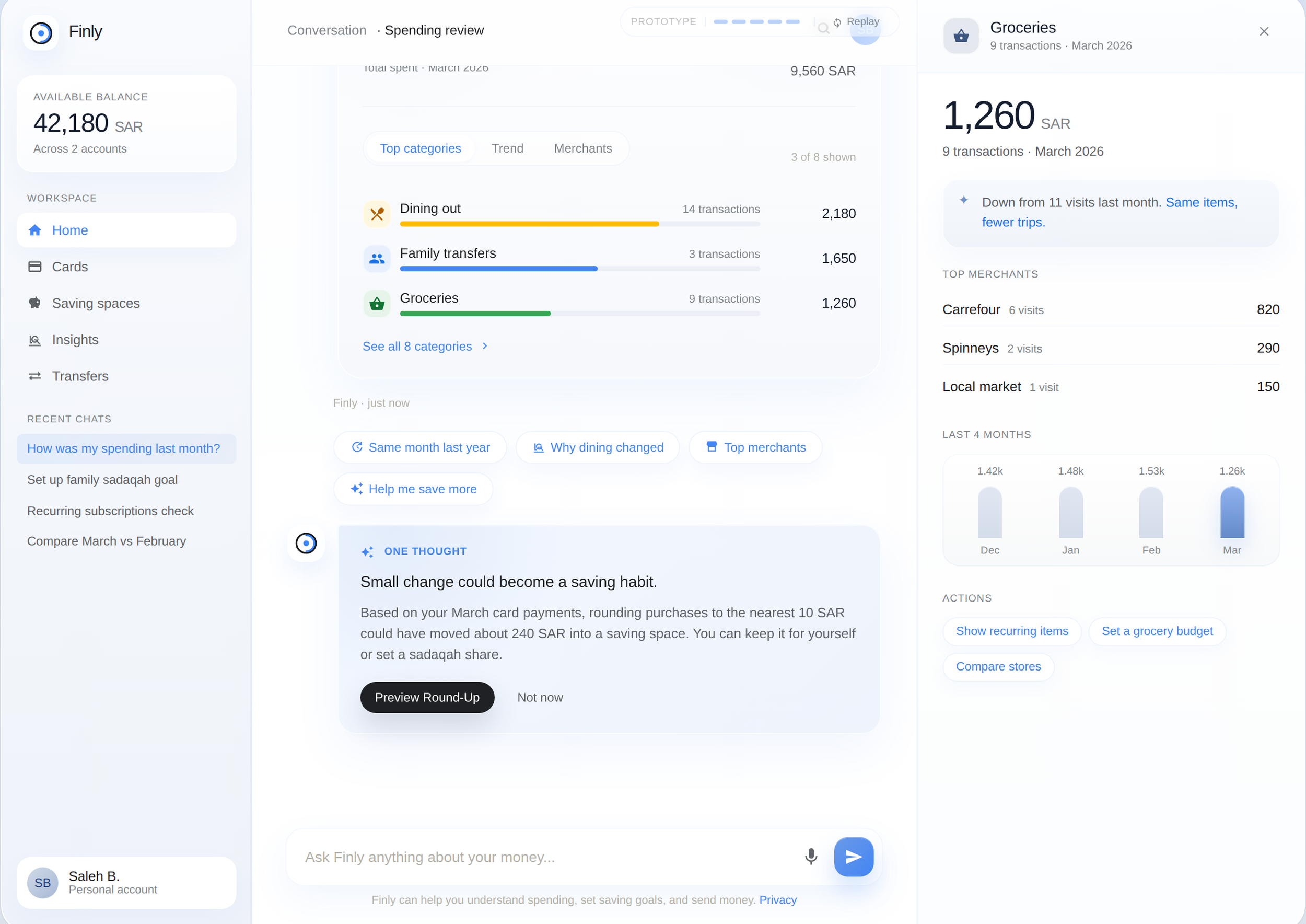
The suggestion surfaces only after exploration, framed as a choice, with dismissal as easy as acceptance.
The designs I killed
I designed three directions and shipped one. The two I rejected matter more than the one I kept, because rejecting a good idea for a clear reason is the actual job.
Rejected · Option B
Data-first summary
A cleaner, more analytical take, charts up top, conversation secondary. Honestly, it could have shipped. It tested well with the optimizer and the provider.
Killed it because: it buried the voice. And the voice was the entire product. A data-first version is just a prettier dashboard, the exact thing I set out to avoid.
Rejected · Option C
Story-mode, Spotify-Wrapped style
Multi-step, animated, memorable. The learner loved it in concept. It was the most "impressive" of the three on first glance.
Killed it because: it's heavy, it doesn't scale to follow-up questions, and a values-conscious bank should feel like a quiet conversation, not a slot machine. Memorable for the wrong reasons.
The pattern in both rejections is the same: each was tempting for a surface reason (cleaner, flashier) and wrong for a structural one. Holding the line on the POV, even against my own good ideas, is what kept the product coherent.
Where I was wrong, and changed course
The visual identity was the part I underestimated. I spent far longer on it than I expected, cycling through palette after palette trying to design something that felt distinctive and ownable. The problem was consistent: every direction I liked ended up echoing an existing bank's identity. The moment a palette felt "premium," it also felt borrowed.
I had to catch myself. The goal of this exploration was the interaction model, not a brand. Inventing a bespoke identity that quietly imitated someone else's was the worst of both worlds, neither original nor neutral. So I made the more disciplined call: instead of faking originality, I built on a proven, intentionally neutral system, Google Material. It let the colour get out of the way so the interaction could be the thing people remember.
Knowing when to design from scratch and when to stand on a system is a senior decision. Here, the system was the right answer, and admitting that took longer than it should have.
What I'd call out honestly
This is a self-directed exploration, not a shipped product, so I won't pretend it has validated metrics. What I'll stand behind:
The honest gap: this hasn't been in front of real users, so the comprehension and trust claims are hypotheses, not outcomes. If this were a real engagement, the next step is unglamorous and essential, put it in front of the optimizer, the provider, and the learner, and find out which of my assumptions survive contact. The business bet behind it is simple: a customer who actually understands their spending trusts the bank more, and trust is the only durable moat a bank has.
See it move
Screenshots show the structure. The video shows the thing the screenshots can't, the feel: the live drill-down, the latency counter reacting in real time, the conversation that never closes.