Rethinking the consent step, the highest-stakes screen in open banking.
The bank-linking consent flow is where open banking lives or dies, the instant a user decides whether to hand over access to their financial life. I rebuilt it into one white-label experience that lifted completion by 27% and could be adopted by any partner bank, in either language, without breaking.
The moment everything hinges on
In open banking, one screen carries more weight than any other: the consent step, where a user approves a third party's access to their bank data. It's the single point where regulators, lawyers, and anxious users all care intensely at the same time. Get it wrong and the user backs out, the whole product fails at the last inch.
And it was failing. The funnel told a brutal story: of everyone who started, more than half dropped before finishing, with the steepest losses clustered right around the providers and consent steps.

The original funnel. Drop-off compounded step over step, with the providers and consent stages bleeding the most users.
Digging into why, the pattern was consistent across user sessions and support tickets:
- Users couldn't tell what data they were actually sharing, or why it was needed.
- The legal text was long and intimidating, it created hesitation exactly where confidence was required.
- Trust cues were missing at the most sensitive step.
- Multi-account selection confused people.
A constraint most case studies never face: this had to be white-label
Tarabut isn't a bank. It's the gateway that sits between banks and the apps that use open banking. That means this flow wasn't designed for one brand, it had to be a neutral shell that any partner bank could adopt and skin as their own.
The interface is intentionally black and white. Not a lack of design, a design decision: a neutral system any bank can wear, while every partner's own brand sits comfortably on top.
That reframes the whole problem. I couldn't lean on color, illustration, or brand personality to build trust, the usual fintech toolkit. Trust had to come from structure, hierarchy, language, and clarity alone. Strip away color as a crutch and the underlying information design has to carry everything. That constraint made the work harder, and the result more honest.
The real challenge: one system, every bank, every regulation
On top of being white-label, the flow had to flex to each bank's rules.
Every partner bank had different mandatory requirements. The flow had to stay identical in feel, yet bend to each bank's regulatory constraints, all within SAMA's compliance framework.
A bespoke design per bank would mean endless inconsistency and slower onboarding for every new partner. A rigid one-size flow would break the moment a bank's compliance rules demanded an extra field or a different disclosure. The job was to design a single, scalable system, consistent enough to feel like one product, flexible enough to absorb each bank's mandated differences without a redesign.
Designing within compliance isn't a limitation on creativity. It's the actual creative problem.
Three concepts, then a synthesis
I explored three directions, each attacking the drop-off from a different angle, then combined the strongest parts of all three into the final system rather than picking one wholesale.
Concept A · Simplified consent
Break permissions into small, digestible parts
Each data permission explained in plain language, one clear line at a time, instead of a wall of legal text.
Concept B · Visual clarity & trust
Strong hierarchy and explicit trust cues
Better spacing, clear structure, and visible trust anchors at the exact moment of hesitation.
Concept C · Reduced steps
A shorter, more guided journey
Fewer stops between intent and completion, minimizing the surface area where users could fall off.
The synthesis took the plain-language permissions from A, the trust hierarchy from B, and the guided pacing from C. But every element had to survive a second filter that most portfolio projects never mention: what compliance and the partner agreements would actually allow. Some ideas I wanted, I had to drop because they conflicted with mandated disclosures. Others I kept specifically because they satisfied a regulatory requirement while still improving clarity. The final design is the intersection of what users needed and what SAMA and each bank's agreement permitted.
The design decisions that moved the number
Making the consent screen legible at a glance
The biggest trust unlock. Instead of burying everything in legal text, I restructured the consent screen so each permission reads in plain language, grouped and scannable, with clear hierarchy between what's being shared and the terms around it. The user can understand the request in seconds instead of abandoning at a wall of text.

The redesigned consent step: permissions in plain language, clear hierarchy, neutral enough for any bank to brand.
A scalable bank-selection pattern
Bank selection applied a simple principle, surface the most-used banks first, make search prominent, and keep the pattern identical across every partner. This is what let new banks onboard faster: the structure didn't have to be reinvented each time.

One bank-selection system, neutral and consistent, designed to scale to every partner institution.
Designed for both Arabic and English, natively
This is a GCC product, so RTL wasn't an afterthought. The entire flow was designed Arabic-first and English-first in parallel, with the layout, iconography, and reading order correct in both, not a mirrored translation.

The end-to-end journey: selection, an explainer overlay, permissions, and the path to the bank, consistent across platforms.
Tested against the old flow, head to head
I didn't want a subjective "it looks better." I ran comparative usability testing, the previous design against the redesign, with real participants in both Arabic and English.
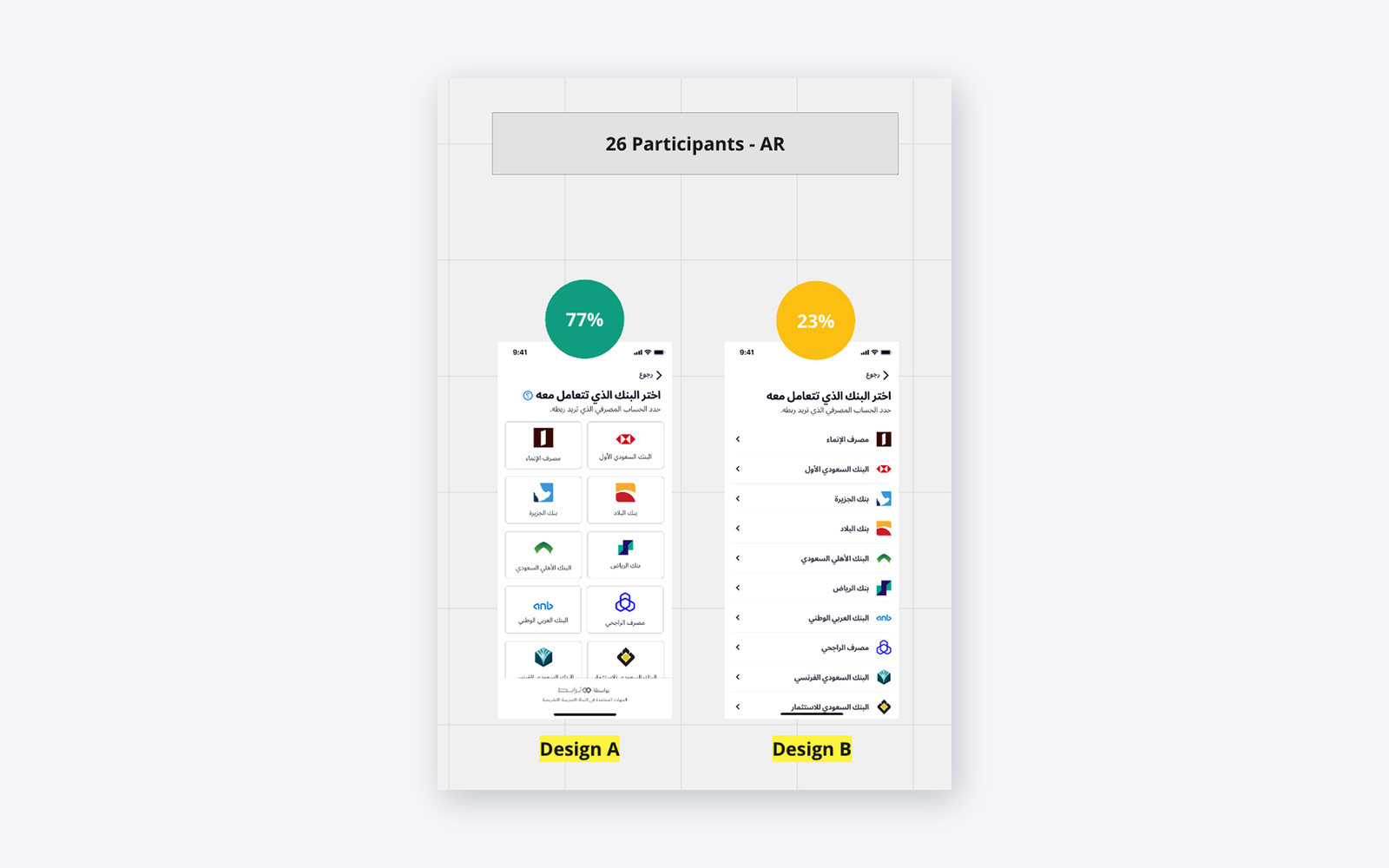
Comparative testing on bank selection: the new grid-based design won clearly against the old list.
Beyond preference, the qualitative signal was consistent: users understood permission types faster, found the legal text far less intimidating, and hesitated noticeably less at the consent step.
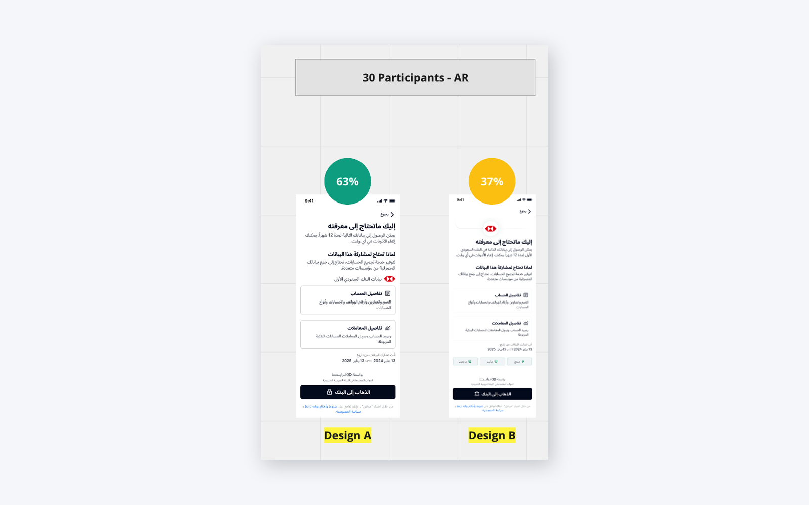
Consent-screen testing: clearer permission framing reduced hesitation at the highest-stakes moment.
Impact
The reusable, white-label pattern paid off twice: once for users, who got a clearer and calmer experience, and once for the business, because every new partner bank could adopt an established, compliance-aware system instead of commissioning a fresh design each time.
What I deliberately left out
A few ideas tested well in concept but I kept them out of the release on purpose, either because they added risk to a regulated flow or because they weren't validated enough to ship into the most sensitive screen in the product:
- AI-assisted bank search and an in-flow help assistant.
- A "Powered by SAMA" trust indication (promising, but needed regulatory sign-off).
- Dynamic account selection based on use case (salary, transfers, payments).
- Personalized ordering for returning users.
In a flow this sensitive, restraint is part of the craft. Shipping an unvalidated idea into the consent step is how you lose the trust the whole redesign was built to earn.
The takeaway
This project wasn't about two prettier screens. It was about making the most sensitive moment in a financial product feel clear, honest, and trustworthy, building trust through structure alone because the white-label shell couldn't lean on brand or color, and making it scale across many banks and two languages inside real regulatory constraints. That combination, user clarity plus compliance-aware, brand-neutral scalability, is the part I'd bring to any fintech team.