Case study 02 · Fashion technology
Maqasi مقاسي
Turning “which size?” into a decision she can trust.
Maqasi recommends a clothing size from a photo of the garment and the shopper's own measurements, with no body photos, then explains the reasoning and flags what might not fit.
- Role
- Founder · product designer · product lead
- Platforms
- iOS · Android · web app
- Technology
- React · Capacitor · Firebase
- Status
- Live on the App Store, Google Play and the web
The opportunity
An XL is not the same size everywhere.
Women shopping online in the Gulf buy from local stores and global marketplaces at the same time. Each uses its own size chart, and the same label can mean different sizes depending on where the garment was made.
The result is guesswork at the moment of purchase, followed by weeks of waiting, returns that are often impractical, or clothes that simply don't get worn.
Existing alternatives
The store's size chart
Accurate for the garment but hard to read, and it doesn't know her measurements, her shape or how she likes clothes to fit.
Virtual try-on and body scanning
Usually asks for body photos or a scan, a request many women in this market won't accept, and for good reason.
Ordering two sizes
Works where returns are free and fast. In much of the region they are neither.
The design opportunity
Replace the guess with an explained recommendation, built only from things she is comfortable sharing: a photo of the garment, the shop's chart, and measurements she types in once.
My ownership
Product, design and delivery, end to end.
I founded Maqasi and own it completely: the problem framing, every flow, the visual identity, the recommendation logic's product rules, the business model, releases and marketing. Implementation was done with AI coding agents under my direction; I specified the behaviour, reviewed the changes, tested on devices and decided what shipped.
What I led
- Problem discovery and months of testing the concept with real garments
- Onboarding, measurement and capture flows, and the result screen
- The cream-and-plum identity and the component system
- Wording of every recommendation and warning, in Arabic and English
- Freemium model, plans, packs and the launch offer
- Store listings, screenshots, ad experiments and measurement setup
What AI-assisted tools contributed
- Implemented the React and Capacitor app, the server and the tests from my specifications
- Powers the garment analysis inside the product
- Drafted copy variants and store assets that I edited
What stayed under my direction
- Which decisions the model is allowed to make, and which must be fixed rules
- The privacy line: garment photos and typed measurements, never body photos
- Pricing and the shape of the free tier
- Every release to the App Store, Google Play and the web
- VS Code
- Xcode
- Android Studio
- Claude Code
- Codex
- Firebase
The core flow
Three inputs, one honest answer.
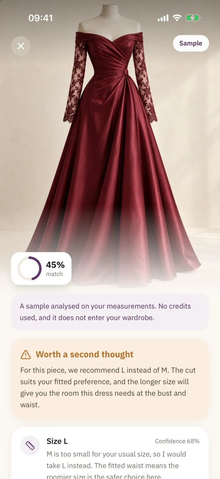
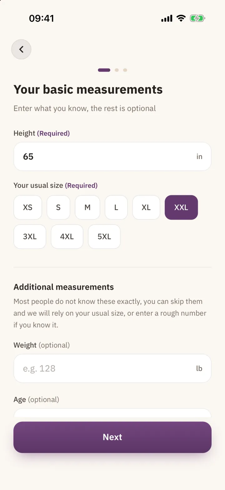
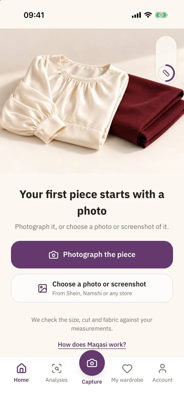
She enters her measurements once, photographs a piece or drops in a screenshot, and gets a size with its reasons. Everything optional is labelled optional.
Discovery & design decisions
Designing for trust when the answer is uncertain.
A size recommendation is a prediction. The design work was mostly about being honest with that uncertainty without making the product feel unsure of itself.
No body photos, ever
- Context
- Body scanning would make the maths easier, and would ask women to share images most of them won't share, especially with a new app.
- Decision
- Maqasi works from the garment, not the body: a photo of the piece, the shop's size chart, and measurements she types. Only height and usual size are required; the rest improves accuracy when she knows it.
- Trade-off
- Less precise input, in exchange for an input she will actually give.
Say it when a piece is a risk
- Context
- A tool that always says "this fits" stops being believed after the first wrong answer.
- Decision
- Results can open with "Worth a second thought", explain why a different size is safer, and show a confidence level next to the size. Warnings about cut, length and fabric sit beside the recommendation, not behind a tap.
AI assists; the product decides
- Context
- A recommendation people pay for has to be consistent. The same garment and the same measurements should never produce two different answers.
- Decision
- I drew a clear line between what AI is used for and what the product decides with its own consistent, testable logic. The result is explainable, repeatable and easy to improve without surprises.
- Trade-off
- More design and engineering work up front, in exchange for results that can be explained and trusted.
Show the shop's own numbers
- Context
- Shoppers don't trust a black box with their money.
- Decision
- Every result can expand into the shop's size table for that exact piece, with her row highlighted, followed by the fabric composition and any sensitivity warning.
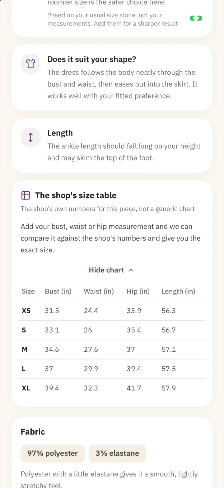
Evidence one tap away. Let her try it before signing up
- Context
- Each analysis has a real running cost, so free analyses belong to an account. But asking for an account before showing any value risked losing people at the door.
- Decision
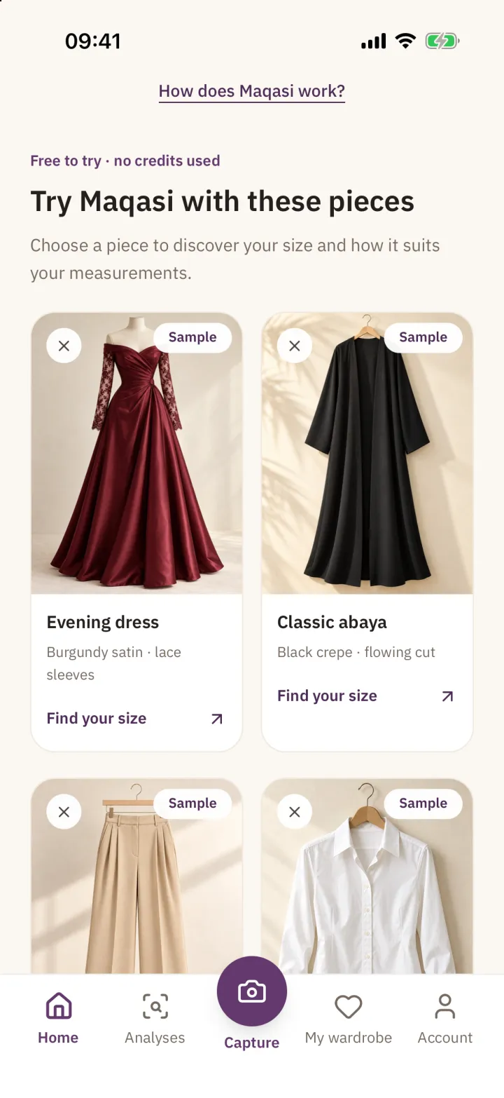
- Guests can now look around and open free sample pieces that use no credits. An account is requested only when she analyses her own garment, and the screen says why: her measurements and balance come back on any device.
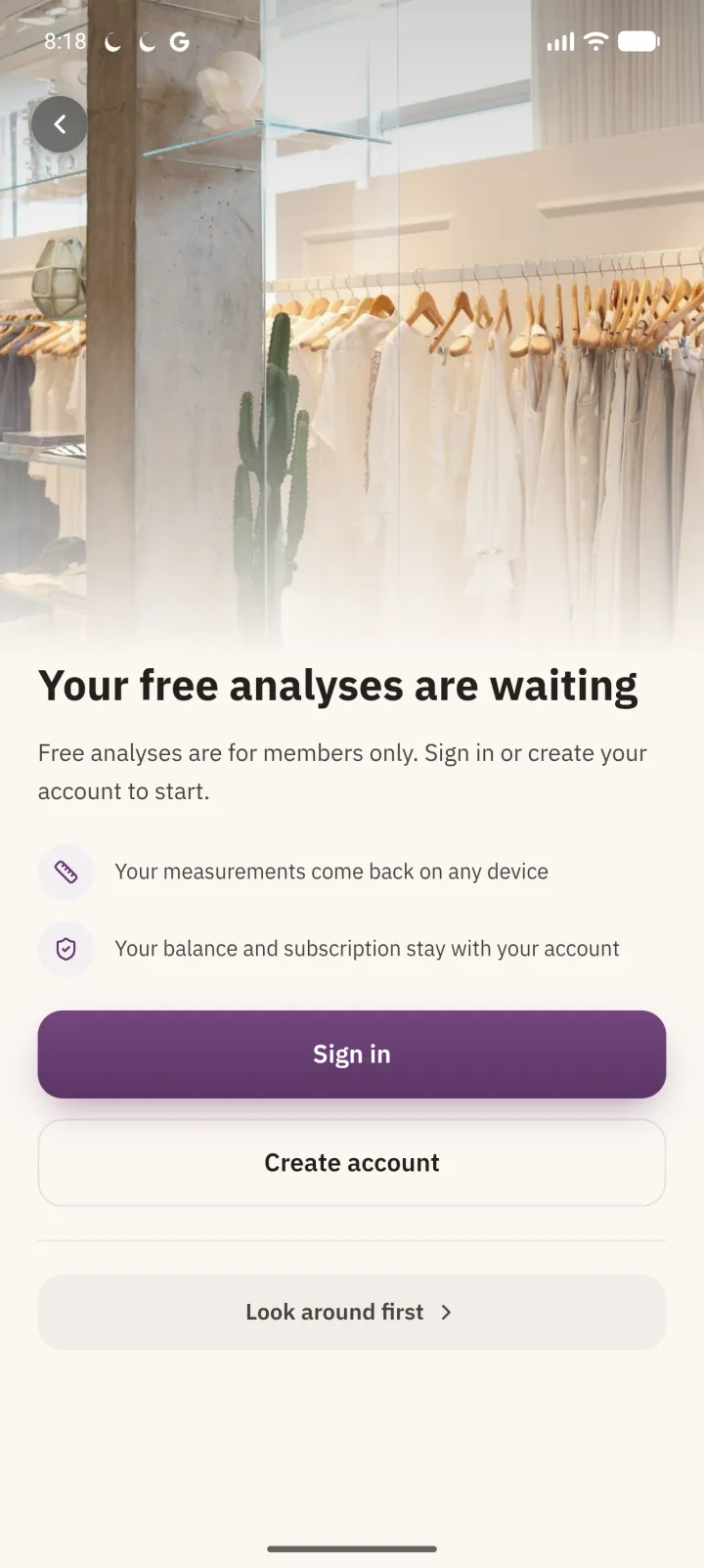
The account ask, with a way to look around first.
Visual design
Quiet luxury, not a shopping cart.
Maqasi had to feel closer to a good boutique than to a marketplace: warm, unhurried and precise. The palette pairs a soft cream canvas with a deep, muted plum, and keeps neutrals warm so garment photography always looks its best. Semantic colours are muted too, so a warning reads as advice rather than alarm.
Colour
- Cream
#FBF7F2App canvas and splash - Sand
#F1E9DESoft surfaces and dividers - Plum 600
#63396DPrimary actions and brand - Plum 900
#2E1A34Display type and deep accents - Ink
#241F1DBody text - Advice
#B4732B"Worth a second thought" warnings
Typography
اعرفي مقاسك قبل الشراء
IBM Plex Sans Arabic · The single typeface for Arabic and English: precise, modern, readable in long explanations
Your right size, without the guesswork
IBM Plex Sans Arabic · Latin · English interface, sharing metrics with the Arabic
Principles
Explain before you sell
Every number on a result has a sentence next to it. Plans are offered only after the free analyses have shown their value.
Accessible warmth
Muted text colours were checked against the cream background; one grey was darkened from about 3.6:1 to 4.9:1 contrast to pass WCAG AA.
Photography leads
Garments are shown large and unframed. The interface stays neutral around them.
Right-to-left by default
Arabic is the primary language. English mirrors the same layouts and keeps Western numerals in both.
Onboarding & monetisation
Value first, then the ask.
Onboarding sells the outcome, not the technology. Every account starts with three free analyses; invited friends earn more, and plans appear once the free analyses are used, with benefits written as outcomes and billed through the stores.
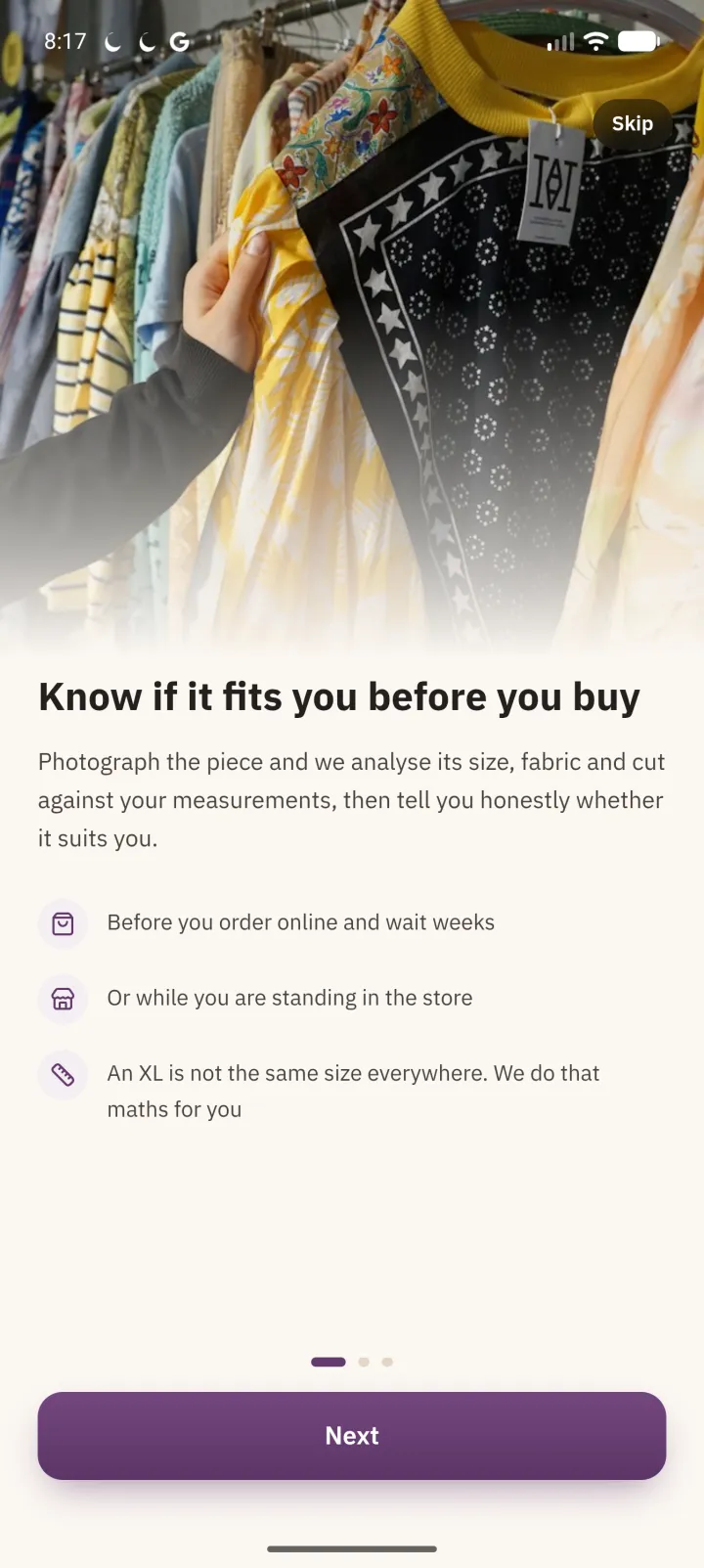
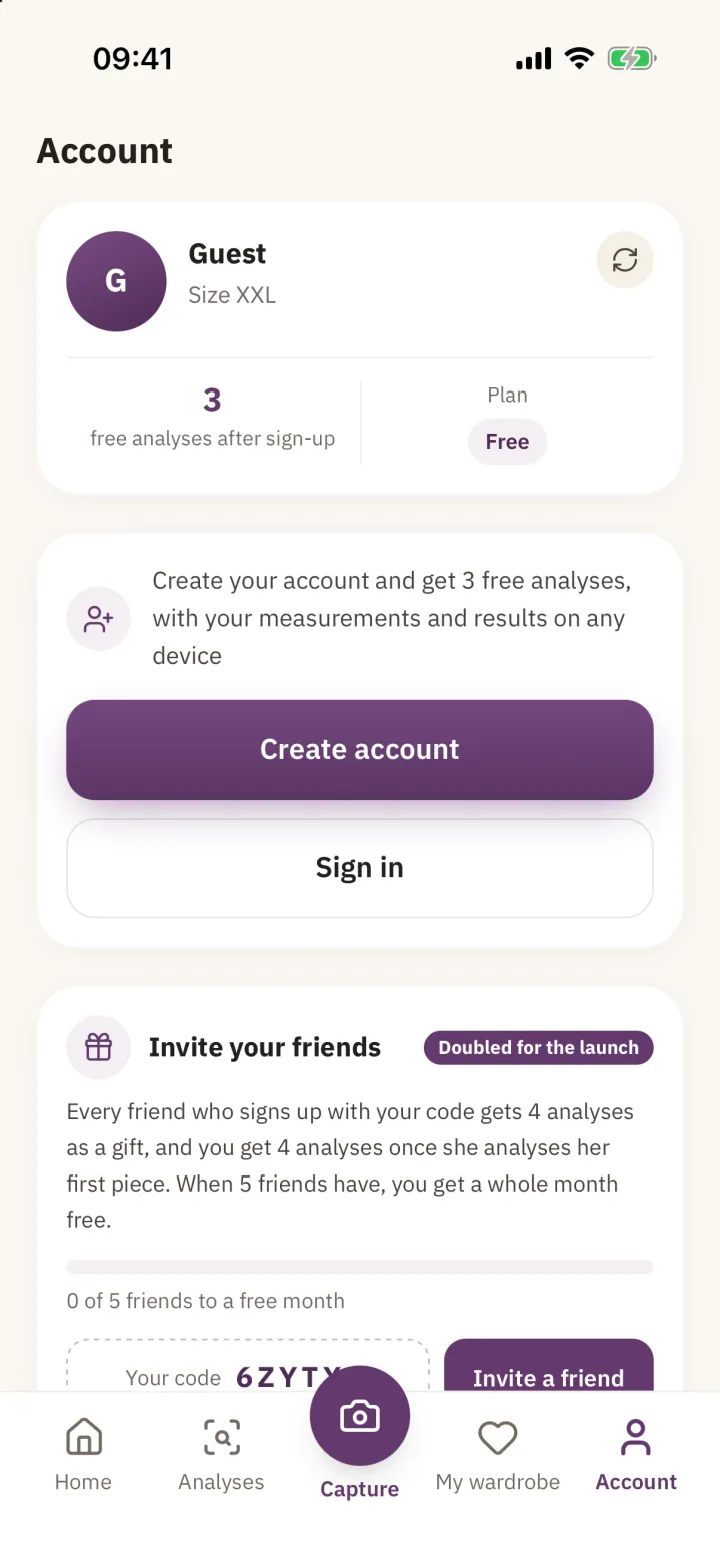
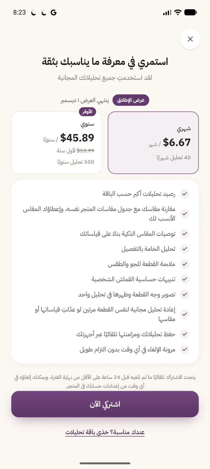
Prices on the plans screen are shown in the store's local currency and change with the launch offer.
From design to production
One web codebase, three storefronts.
I built Maqasi with web technologies and wrapped it with Capacitor for iOS and Android. One React codebase serves the web app and both native apps, which let me iterate on the result screen daily and ship the same experience everywhere. The trade-off is that native capabilities like billing, sign-in and push arrive through plugins, and each needs platform-specific care.
- One codebase
- React and TypeScript, shipped to the web and wrapped for iOS and Android with Capacitor
- Accounts
- Sign in with Google or Apple, so measurements and results follow her across devices
- Business model
- Free analyses to start, then store subscriptions or one-time packs
Design intent survives in tokens
Colours, type and radii live in one Tailwind theme shared by the web and native builds, so a change to the plum or the cream reaches every platform at once.
A fair free tier
Free analyses are tied to an account rather than to a device, so the free tier stays fair for everyone and sustainable to run.
Device testing on both platforms
Every release was checked on iOS and Android devices, because sign-in, camera and purchase flows behave differently on each.
Learning from real fit
After wearing a piece, a shopper can say how it actually fit. That feedback feeds back into the product, so recommendations improve with real-world outcomes rather than assumptions.
Launch & real-world validation
Early signals, measured honestly.
Maqasi is live and still early. These are the numbers I can source today. Registered users, paying subscribers and revenue are tracked in the product's own dashboard and will be added once confirmed for publication.
- Downloads1K+Google Play downloads (Play's public install bracket)Google Play listing · 20 Oct 2026
- Delivery1.3.4 → 1.10.5Native releases between the August baseline and todayApp repository and store builds · Aug–Oct 2026
- Engagement1.69%Click-through rate on a small Snapchat traffic test (88 clicks, 59 landing-page views)Snapchat Ads Manager · 27 Sep–17 Oct 2026
- Ad spendUS$24.66Total spend on that test, about US$0.42 per landing-page viewSnapchat Ads Manager · 27 Sep–17 Oct 2026
Experiments and what they taught me
Traffic is not installs
The Snapchat test bought cheap visits to the website, but visits didn't tell me who installed. The next campaigns were set up as app-install campaigns measured on first app open.
Fix measurement before spending
Before committing an iOS budget, I found that iOS installs weren't being attributed and fixed the measurement setup first, so spend could actually teach something.
Lower the first step
Free sample pieces that use no credits, then non-expiring analysis packs for occasions, were added to test whether a lighter first commitment converts better than a subscription-only offer.
Not yet available, and why
- Registered users, active users and retention: to be confirmed from the product dashboard.
- Paying subscribers and revenue: to be confirmed.
- App Store downloads: to be added from App Store Connect.
Challenges & lessons
What testing with real clothes taught me.
Labels are a trap
Wrong sizes often came from the label, not the maths: the same letter means different things in different sizing systems. Handling that consistently fixed a whole class of errors at once.
Explaining costs screen space
A size with reasons, warnings and the shop's table makes a long result. I kept the verdict and its confidence at the top and pushed evidence below it, so the screen works for a glance and for a careful read.
The first ask matters as much as the price
Asking for an account before showing any value is a large request for a new app. Moving it behind free sample pieces is a bet I am now measuring, rather than a result I can claim.
Speed versus certainty
Shipping from one codebase made frequent releases possible. Plugin edge cases in billing and sign-in were the price, and each needed device testing on both platforms.
Reflection
AI is the input. The product is the judgement.
Maqasi shows how I design AI products people can trust: decide where AI helps and where the product must stay consistent, and design the language of uncertainty as carefully as the visuals.
What I learned
- Privacy constraints can make a better product. Designing without body photos forced clearer inputs and clearer explanations.
- Monetisation is a design surface. Credits, packs, samples and offers are UX decisions, not just pricing.
- Measurement has to be designed before marketing, or spend teaches nothing.
What I would investigate next
- Publishing verified funnel numbers from account creation to first paid analysis.
- Retailer partnerships that bring size charts in directly.
- Measuring fit outcomes before and after each improvement.
Building an AI product people need to trust?
I design the experience and the rules around the model: what it decides, what it explains, and how the product earns belief.