The product was live. It just wasn't selling.
Buyers could add tinting, warranty, and coating while purchasing a car. Almost none of them did. I spent the next stretch finding out why, and the answer wasn't a prettier screen. It was timing. Here's how rebuilding the journey took service revenue up 11%.

An MVP that looked finished, but behaved like a placeholder.
When I joined Cars24, the value-added-services feature was already shipped. On paper it made sense: someone buying a car could add tinting, an extended warranty, or ceramic coating in the same flow. Convenient. Logical. Good for the business.
Except the numbers told a different story. People reached the services step and left. Drop-off was high, engagement was low, and the few who did add a service usually did it because a human talked them into it later, not because the product did its job.
I owned this end to end, research, design, and the handoff to engineering. My brief was simple to say and hard to do: make it user-first, kill the friction, and get the product to sell the way our best people did.
I didn't start in Figma. I started with what was making people leave.
Before touching a single screen, I went looking for the friction. I pulled it from three places that don't lie: NPS verbatims, one-on-one interviews, and field visits where I watched real buyers and sat with the sales floor.
The same complaints kept surfacing, in the buyers' own words.
I clustered the raw feedback into patterns, so the redesign answered real frustration instead of my assumptions about it.


They met it too late
Most buyers first heard about services on a call with a Relationship Manager, after they'd already paid a token and committed. The product stayed silent until then.
They couldn't read the menu
Required or optional? Worth it or not? The flow didn't say, so people froze rather than risk the wrong call.
They leaned on a human
Understanding a service meant waiting for a rep to explain it. Slow, and gone the moment the car was delivered.
The best reps weren't better talkers. They were better timers.
Here's the thing that changed the whole project: some Relationship Managers closed far more service deals than others. Same script, same prices, wildly different results. So instead of guessing, I studied exactly what the top performers did differently, and it turned out to be a design brief hiding in plain sight.
They showed, never just told
The top closers always sent photos and short clips over WhatsApp. A buyer who sees 30% vs 50% tint decides in seconds. A buyer who reads a spec sheet stalls. That alone reframed the redesign around visuals first.
They answered the question actually being asked
"Will scratches still show after coating?" "Are engine parts covered, or just labour?" I collected the real questions from rep calls and made the flow answer them in place, instead of leaving buyers to wonder.
They tailored the pitch
Good reps read the person, price-conscious or premium, compact or SUV, and led with what mattered to them. That's the whole case for a journey that adapts instead of one that marches everyone down the same hallway.
They reassured at the exact moment of doubt
When someone hesitated, the line was always some version of "my last three customers with a car like yours all added coating." Social proof, delivered right when it counts. I designed for that moment, not around it.
A hunch is a starting point. I wanted the numbers to agree.
I cross-referenced what the best reps did against the actual behaviour and conversion data, so every design decision had something underneath it besides instinct.

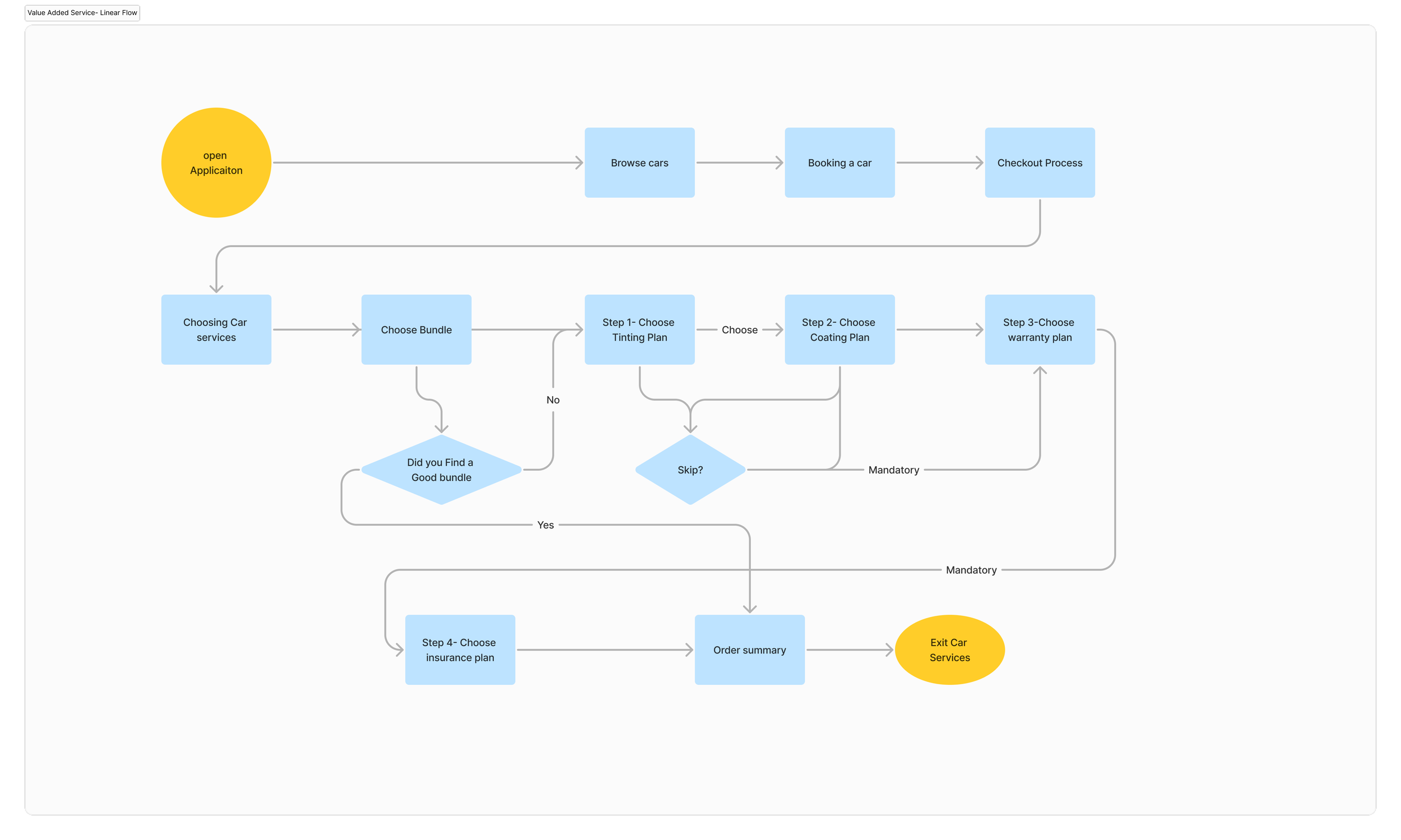
Stop making everyone walk the same line.
The old flow was linear: one fixed sequence, every buyer pushed through every option in order. It had a fatal flaw, every new service made the journey longer for everyone, whether they cared or not. It couldn't scale, and it buried the things people actually wanted.
So I rebuilt it as a non-linear journey. The product surfaces the right service at the right moment, shows each buyer only what's relevant to them, and grows the catalogue without growing the friction. This one architectural call is what made everything after it possible.

Before the final screens, a lot of exploration. This is where the thinking happened.
I don't arrive at the answer in one jump. I set a direction, sketch the options, pressure-test them, and let the weak ideas die early. Here's some of that middle, the part most case studies hide.


I had the old linear screens in front of me the whole time. It would've been easy to polish them and call it a redesign. The harder, right move was admitting the structure itself was the problem, and rebuilding it, not repainting it.

Show the right service the moment the buyer is already thinking about the car.
Every move in the final design traces back to one idea: stop saving the pitch for a phone call. Pull it forward, make it visual, and answer the question before it's asked.

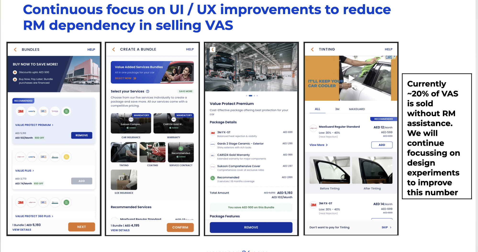
Services show up while they're still picking the car
Short, benefit-led callouts for tinting, warranty, and coating live right on the car detail page, the moment a buyer is already weighing it up, not bolted onto the end after they've committed.
See it before you buy it
Because the best closers always sent visuals, the redesign leads with them. Previews show a car with the tint or coating applied and answer the exact questions buyers used to ask reps, so they can decide on their own, with confidence.
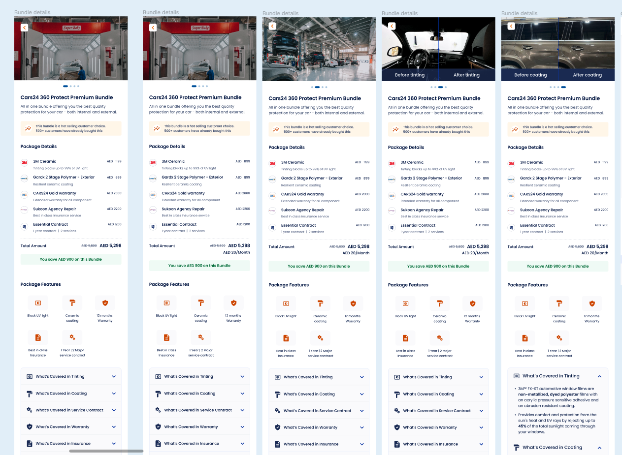

Bundles that read in a glance
A cleaner bundle layout in plain language made it obvious what each package included, and nudged more buyers to act without needing anyone to hold their hand.


The shipped journey, end to end.
Static screens only get you so far. Here's the real thing, the way a buyer actually moves through it, from browsing a car to discovering and adding a service.
It tested better, and it sold better. Both mattered.
This didn't go live on faith. I ran it as a real A/B test against the existing experience, so the wins are measured, not claimed.
Service revenue
The headline number. Service revenue rose after the redesigned experience shipped, the proof that clarity and timing move money.
Attach rate
The new bundle layout lifted attach rate in A/B testing. Modest on its own, but a clean, low-risk win that confirmed the direction.
Less RM dependency
More buyers finished on their own, exactly the goal: a product that explains itself instead of waiting for a human to.

The bundle layout won by +1.2%. Individual services stayed roughly flat. I'm not going to dress that up, the point of the test wasn't a giant jump, it was proving the redesign didn't hurt performance (always the real risk) while nudging more people to act and lean on reps less. It did both.
Three things this one taught me.
Timing is a design material
The biggest lever wasn't a better screen, it was moving discovery earlier. When someone meets a service decides whether they ever consider it at all.
Your best people are research
The top reps had already solved this on the phone. My job was to notice what they did, visuals, real answers, the right pitch, and bake it into the product.
Sometimes you rebuild, not repaint
A linear flow gets heavier with every option. The win came from changing the structure, not decorating the old one. Knowing the difference is half the job.
Got a flow that's losing people at the wrong moment?
That's the work I like most: finding where a journey leaks, and rebuilding it on evidence instead of guesswork.
Start a conversation →