Arabic content commerce · Mobile redesign
When the teacher is also the product.
Sumaya 369 sells courses, bundles and books from one of the best known self development names in Saudi Arabia. I rebuilt the mobile experience around one question: how do you sell a person's work without making it feel like a shop?
This was a redesign of a live product, not a new build. The brand, the catalogue and the content already existed, and I was asked to rebuild the mobile experience on top of them. What I handed over was the mobile template: the layout system, the card model, the navigation and the footer. Content, campaigns and catalogue have been refreshed many times since, as they should be. The template underneath is still in the product.
The problem
A personal brand and a store, competing for the same screen.
Most e-commerce mobile pages have one job. Show the products, get to checkout. This one had three, all above the fold of a customer's attention.
Who is she, and why should I trust her with my money. What exactly am I buying, since a course is not a physical object. And how does buying even work here, because a subscription to a learning library is not the same as adding a shirt to a basket.
Get the order wrong and one of the three eats the other two. Lead with the person and it reads as a fan page. Lead with the catalogue and a first time visitor has no reason to care.
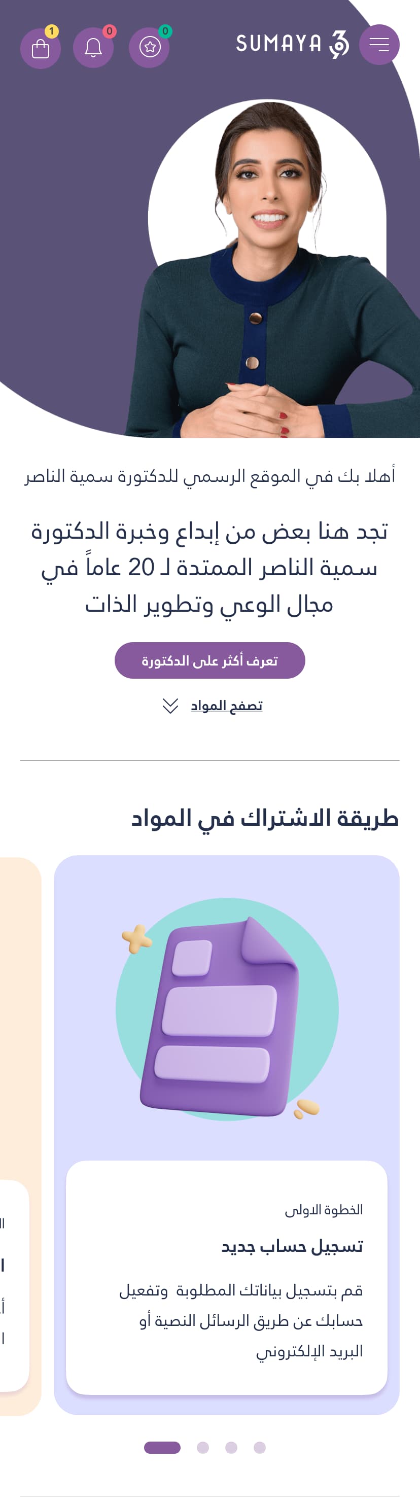
The opening sequence. Who she is, then what she offers, then how buying works, in that order.
Decision one
If people need instructions to buy, put the instructions on the homepage.
Explaining how to purchase, on the homepage, is normally a design smell. It usually means the purchase flow failed and copy is being asked to rescue it.
Here it was the right call, and the reason is specific to the product. A visitor arrives from an Instagram post about one lecture. What they find is an account, a library, a subscription per item, bundles, and a student discount tier. The model is genuinely unfamiliar, and hiding it does not make it simpler.
So the steps sit high on the page as a short numbered sequence: create an account, add your details, activate by SMS or email. Three steps, no surprises, before anyone is asked to spend anything.
Decision two
Show the tax on the card, not at the till.
Every material carries two numbers. The price, and the price including VAT. They sit together on the card, before the button.
The lazy version puts the clean number on the card and reveals the real total at checkout. It converts better on the click and worse on the purchase, and it costs you the trust of exactly the customer who was hesitating.
The bundles use the same honesty and turn it into the argument. A single material against eight in a bundle, both totals visible, so the comparison happens on the page instead of in the customer's head.
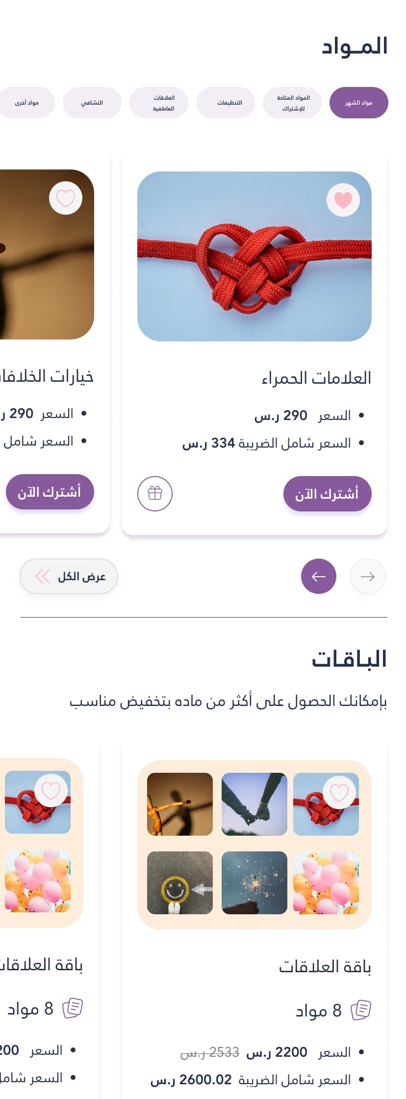
Materials, filters, and the bundle offer immediately underneath.
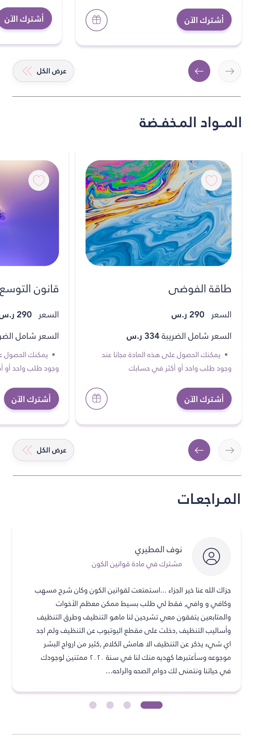
Discounted items, then reviews from named customers.
Decision three
Proof does more work than persuasion.
For a product built on one person's authority, the strongest thing you can show is other people who already paid.
So the page stacks evidence in increasing scale. First a review with a real name and a real paragraph. Then the yearly numbers, subscribers to materials, subscribers to bundles, total visitors. Then the articles, each carrying its own view and comment count.
None of that is decoration. Each block answers the same silent question from a different angle: am I the only one about to do this?
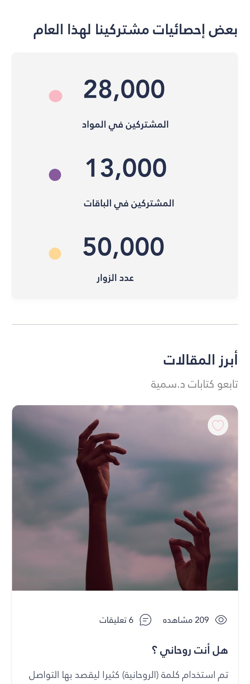
Numbers as reassurance, at the scale of the whole platform.
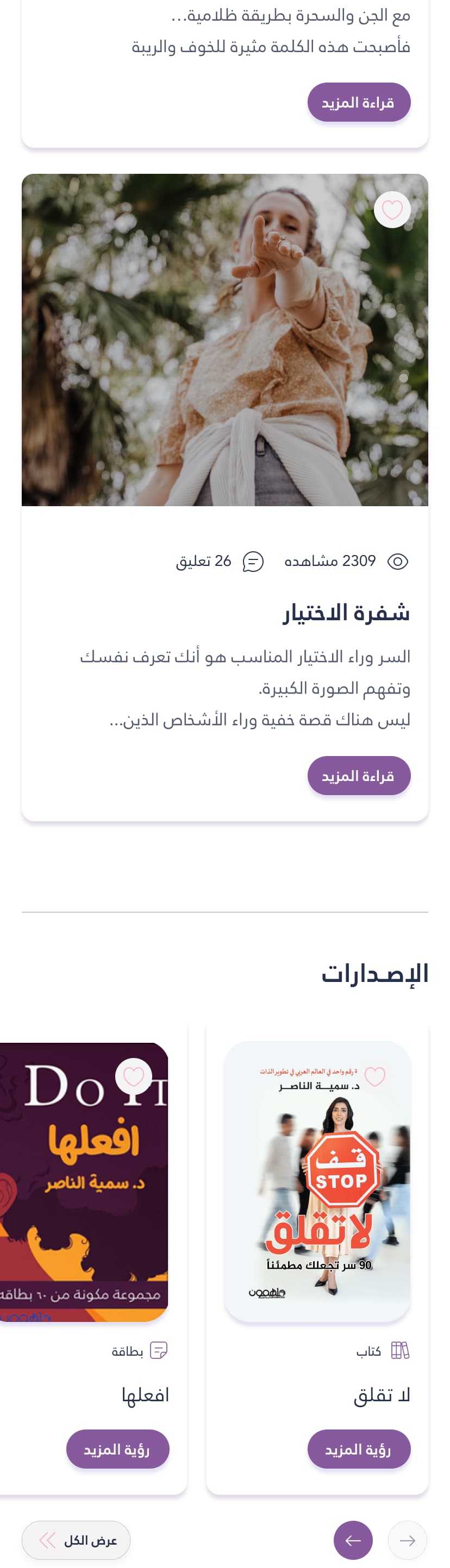
Then the same job at article and publication level.
Decision four
Two menus, because signed in is a different person.
Before signing in, the visitor is shopping. The menu is about discovery: all materials, discounted materials, publications, articles, events of the month, the FAQ.
After signing in, the same person is a student. The menu opens with their name, then my subscriptions, my orders, account settings, favourites, and the student discount tier.
Serving both from one generic list would have made the menu longer and the product colder. Splitting it kept each state short, and made returning feel like coming back to something that is yours.
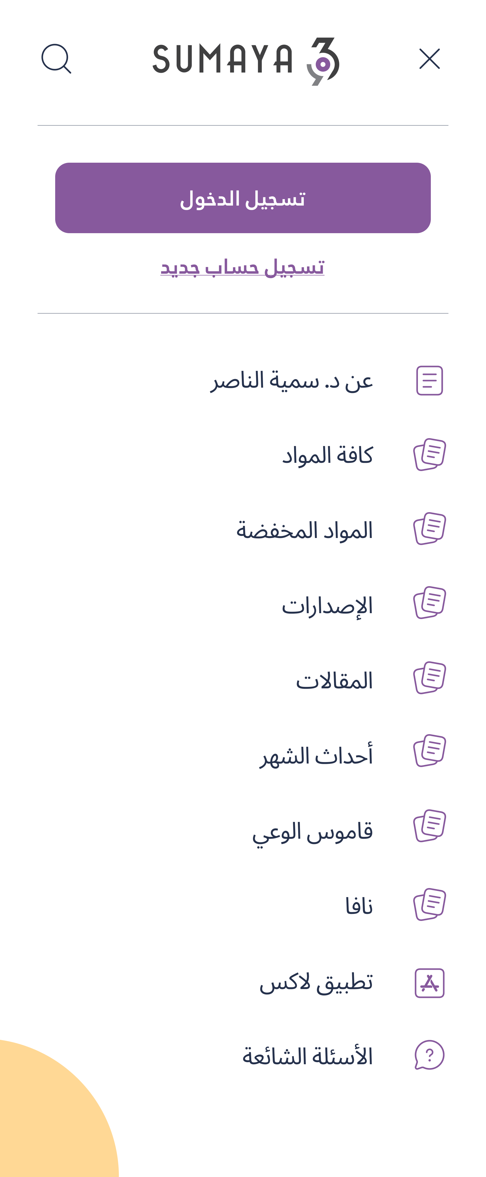
Signed out. Browse and discover.
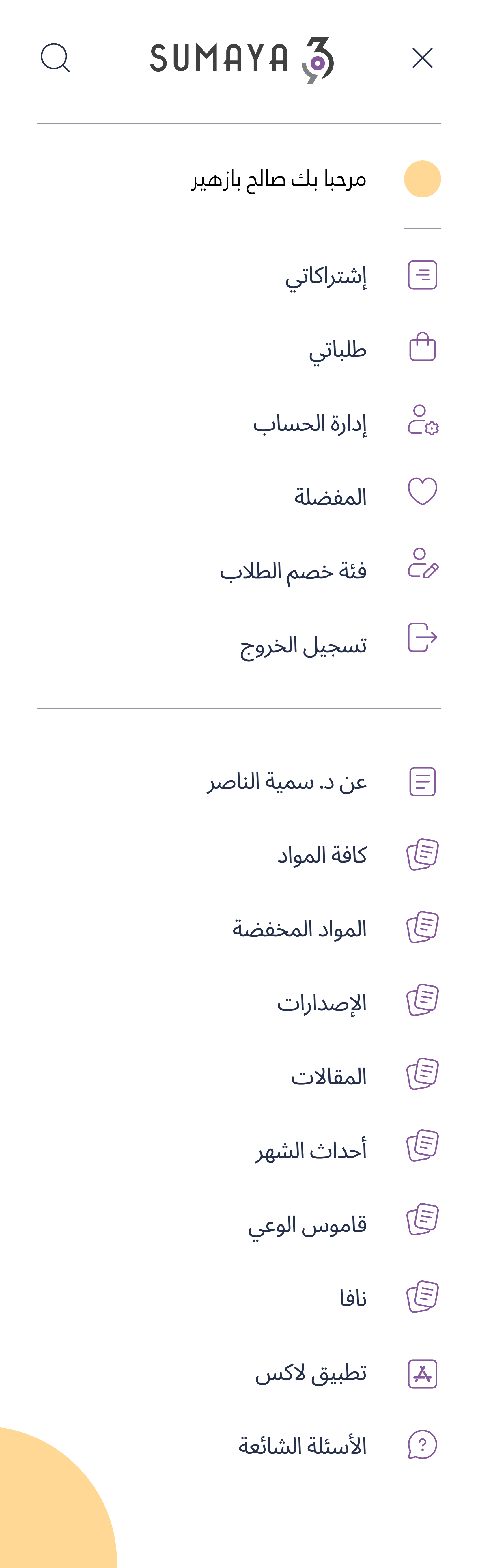
Signed in. Your name, your subscriptions, your orders.
Decision five
The payment row is not footer decoration.
Seven payment methods sit near the bottom of the page: the local debit network, the local wallet, Apple Pay, the two international cards, and two buy now pay later services. Next to them, the tax registration badge.
In this market that row is a conversion element. A customer deciding whether a two thousand riyal bundle is possible this month is really asking whether they can split it into four payments. Burying that answer costs sales from people who were ready to buy.
The platform has since taken that further. Bundle cards now carry the monthly instalment as a headline number, beside the full price. The question customers were silently asking is now answered before they have to ask it.

The end of the page still has a job. Capture the people who are not ready, and reassure the ones who are.
The part most teams underestimate
This is an Arabic layout, not a mirrored English one.
- Prices run against the textArabic reads right to left, numerals do not. Every price, every tax figure, every subscriber count is a small direction change inside a right to left line, and each one is a chance for the layout to break.
- Carousels have to start from the rightThe first card of a row must be the one nearest the reader's entry point. Reuse an English carousel and the newest material quietly becomes the hardest one to find.
- Arabic titles do not fit English card sizesCourse names here run long. Cards had to be built to breathe at two and three lines rather than truncate, because a cut title on a product you cannot physically see is a lost sale.
- Icons that imply direction get redrawnArrows, progress, next and back. Mirroring some of them is correct, mirroring all of them is how a screen ends up feeling subtly wrong to a native reader who cannot say why.
The result
The content changed. The template did not.
I have no analytics from this platform, so there is no percentage on this page. What I can show instead is the live product, years later, still standing on the layout I delivered.
- The opening still works the same wayPortrait, welcome, two stacked calls to action. Then a filter sitting above a two column grid of materials.
- The product card is unchanged in structureImage, favourite, badge, title, rating, the price and the price with tax together, then add to cart beside the gift action.
- The bundle still makes the same argumentMore materials for less, stated as a direct comparison against buying the items separately, with both totals visible.
- The page sequence heldMaterials, then discounted materials, then reviews in a carousel, then publications under tabs, then the newsletter.
- The footer runs in the exact order I setLogo, description, newsletter, important links, social, payment methods, rights.
Two things did not survive, and both for good reasons.
The steps explaining how to subscribe are gone. They were there in the first place because the model was unfamiliar in 2023. Years later the audience knows how it works, so the explanation had done its job and retired.
The subscriber statistics block is gone too. When a store is proving itself, a headline number matters. Once every product carries hundreds of visible ratings, the proof has moved closer to the purchase, which is where it belongs.
A layout that survives years of content change is a specific kind of proof. It means the decisions were structural rather than decorative. Anything built on a trend would have been replaced by the next campaign. You can check every point above against the live product at sumaya369.net.
Selling something complex in Arabic?
Subscriptions, bundles, tax, instalments, and a right to left layout that has to feel native.
Start a conversation