
Healthcare booking and clinic software · 2018

Getting people to trust a doctor they have never met.

Meddy helped people in the Gulf book a doctor online. Almost all of them used to ask family instead. I was the only designer, on the patient side and the clinic side.

Role
Sole product designer
Year
2018
I owned
Flows, structure, UI, design system, measurement after launch
Built for
Web and mobile web

This shipped in 2018, so the visual style is from 2018. The decisions are the part worth reading. At the end of this page I have written what I would build differently today, and why.

The problem

Two sides. Two different fears.

Patients

They were not looking for the cheapest doctor. They were worried.

Is this doctor any good? Will I wait two hours? Will they take my insurance at the desk?

None of those answers were online. So people closed the tab and called a cousin.

Clinics

They were not afraid of software. They were afraid of two other things.

Public reviews they could not answer. And more work for a front desk that was already busy.

To a clinic manager, we looked like a risk with a login page.

That set the rule for the whole project. If I asked a patient for more information, or a clinic for more work, I had to give something back on the same screen. If I did not, both sides would leave in the first month.

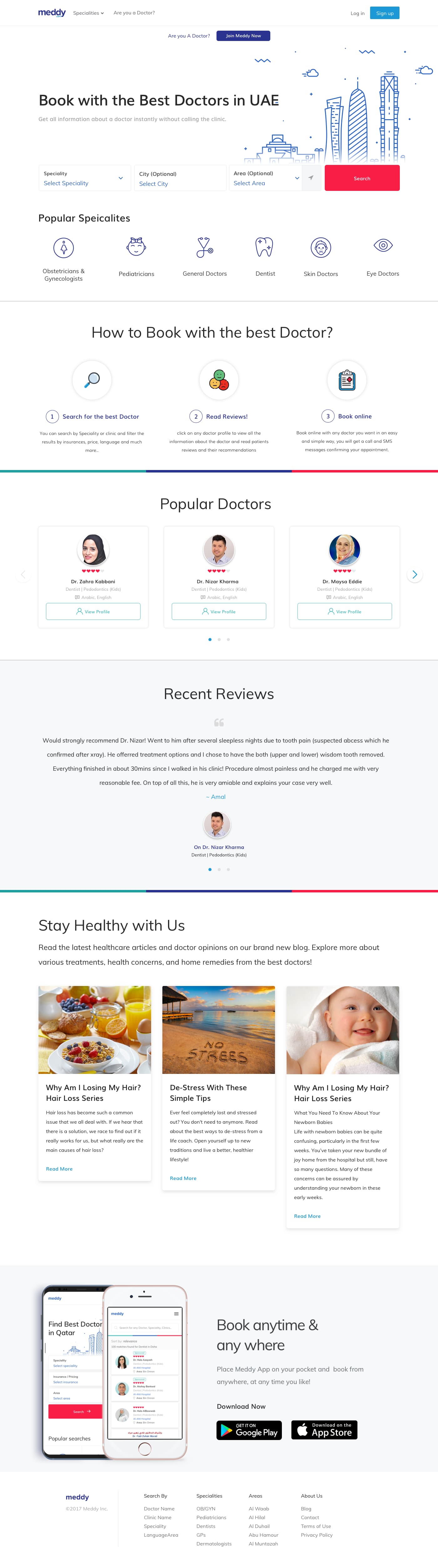
Meddy homepage showing doctor search by specialty and location

The homepage had one job. Show someone that the answer they usually get from family is here too, and faster.

For patients

Every screen had to remove one worry.

People already had a way to choose a doctor. They asked family. My job was not to replace that habit. It was to put the same thing on a screen, and make it faster.

  • Reviews from people who actually wentAn opinion only helps you if you know it came from a real visit. That is the whole reason you would trust a stranger about your health.
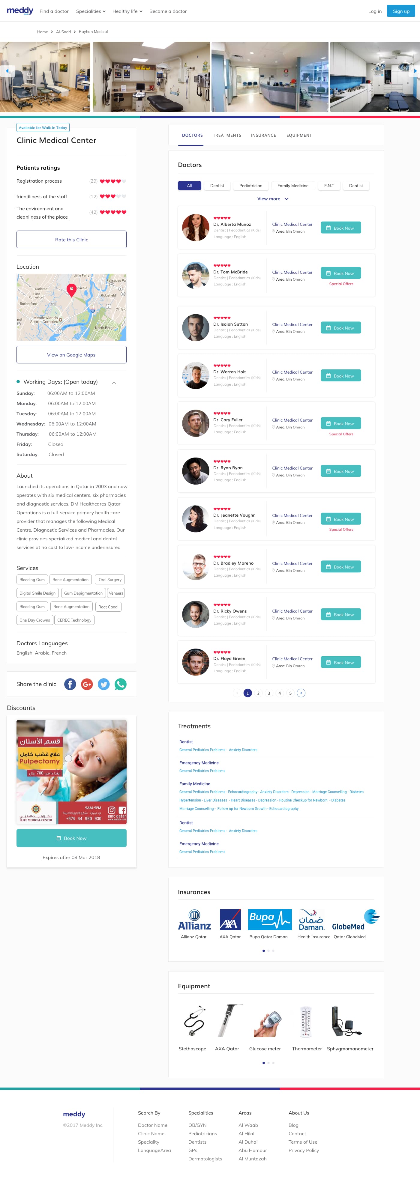
  • Photos of the real clinicYou want to know what the place looks like before you walk in. Is it clean? Is there a waiting area? We put that on the profile instead of asking people to guess.
  • Insurance and qualifications above the buttonTwo questions decide everything. Will they take my insurance, and is this doctor qualified. Both had to be answered before the booking button, not after it.
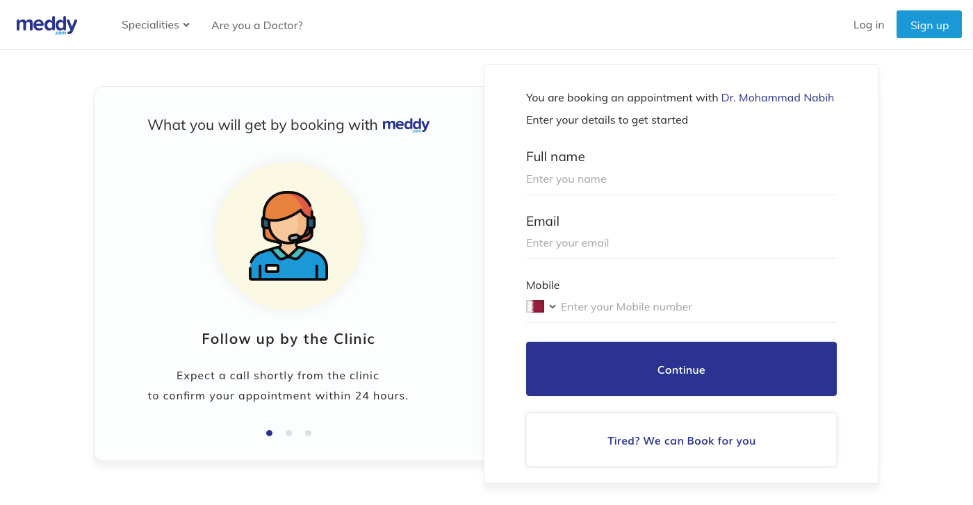
  • Booking asks for almost nothingEmail and phone number. That is it. People are closest to quitting at the exact moment most products ask for the most.
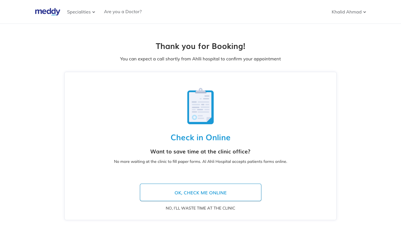
  • A confirmation that calms you downAfter you book, you still worry. Did it go through? Will they have my name at the desk? The confirmation screen and the SMS were there to stop that worry, not to act as a receipt.
Meddy clinic profile page with photos, doctor credentials, reviews and insurance information

The clinic profile carried the decision. Reviews, qualifications and insurance sit above the booking action.

Meddy booking step one asking only for email and phone number

Booking asks for two fields.

Meddy booking confirmation screen leading into digital check in

Confirmation, then an invitation to check in.

The decision I still defend

We asked for medical history last, not first.

Most systems ask for the valuable medical data early, while the person is still motivated. I built the check in the other way around.

Each early step is easy to answer. Each one also shows the patient that the system is careful with them. Only after that do we ask the hard question.

  1. Start from something they already trust

    Check in begins from the booking confirmation, not from a cold form sent hours later.

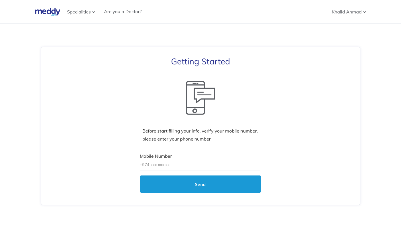
  2. Verify the number first

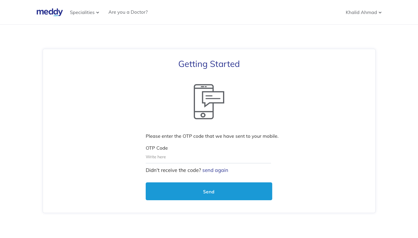
    A one time code. Before we ask anyone to be open with us, we show them we are careful.

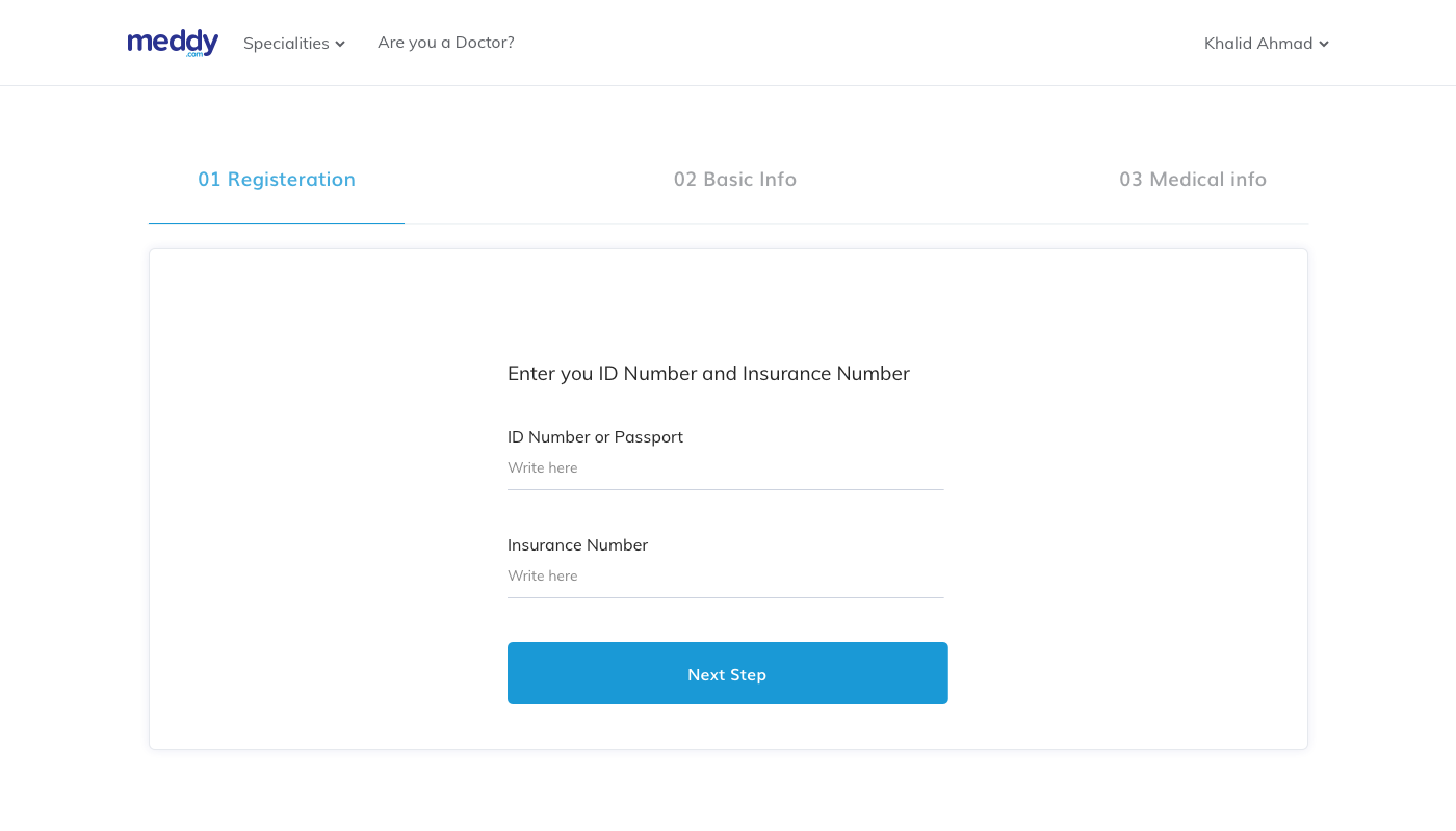
  3. Name and basic details

    Easy, familiar, fast. This is where people build momentum.

  4. Medical information at the end

    The most personal question arrives only after four screens have earned it.

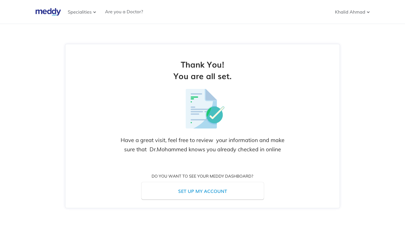
  5. A clear finish, and a way to pause

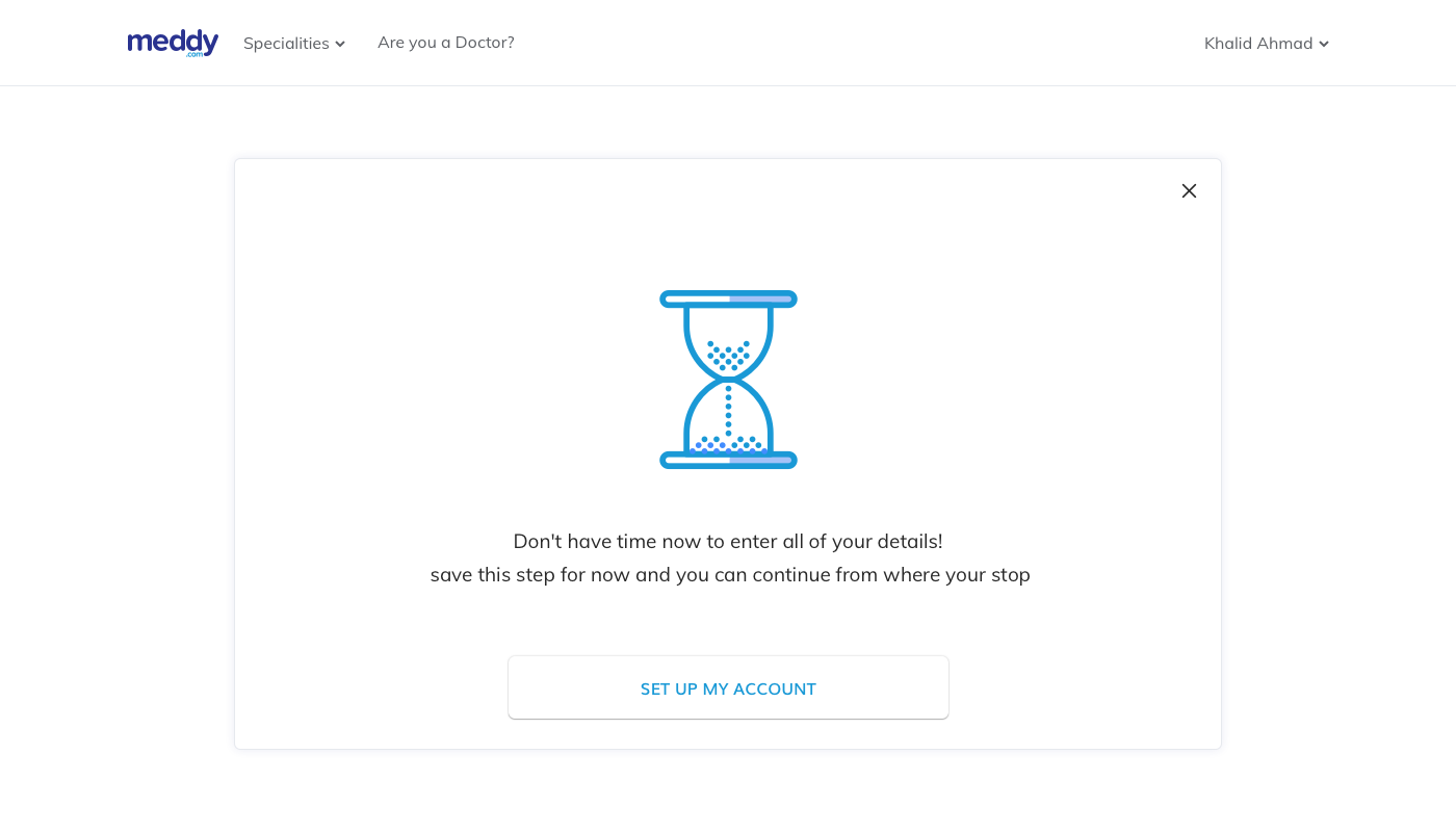
    If you leave halfway, your answers are saved.

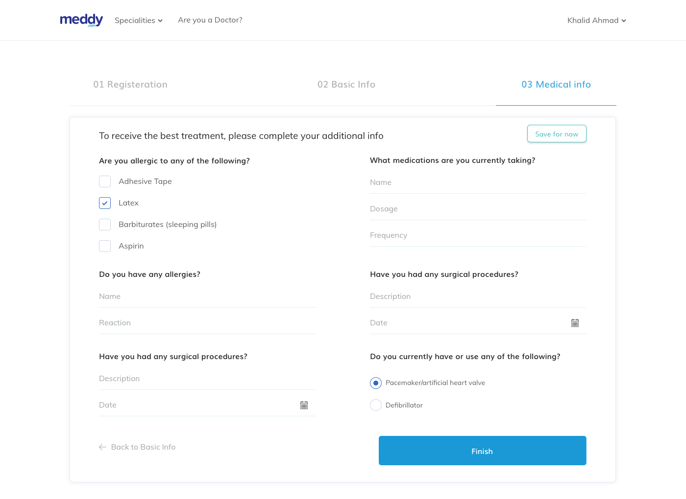
Meddy check in medical information step, positioned last in the flow

Step three of check in. People fill these forms while they are unwell, interrupted, or waiting for a parent to answer a question about an old surgery. That is why the save prompt exists.

For clinics

You cannot train a clinic into using software it resents.

Adoption was not a training problem. Clinics understood the software fine. They just did not want it. So the design had to give them something they actually wanted.

  • Let them show off their clinicMy proposal. Clinics could publish photos of their own space, the reception, the equipment, the waiting area. Suddenly filling in the profile was not paperwork. It was advertising. Clinics that had ignored empty fields started asking to add more.
  • Let doctors reply to reviewsThis idea came from the team, and I designed the flow. Fear of bad reviews was the number one reason clinics said no. A public right of reply turned that fear into the reason they said yes.
  • The patient's form arrives before the patient doesEverything a patient filled during check in reached the front desk as a clean record. The clinic got real value from work it did not have to do.
  • Show the front desk the number that hurtsNo shows are the clinic's real loss. Putting that count on the calendar, next to the appointments it came from, gave the manager a reason to open the dashboard every morning.
  • One design system across both productsSo the product could keep growing without hiring a second designer.
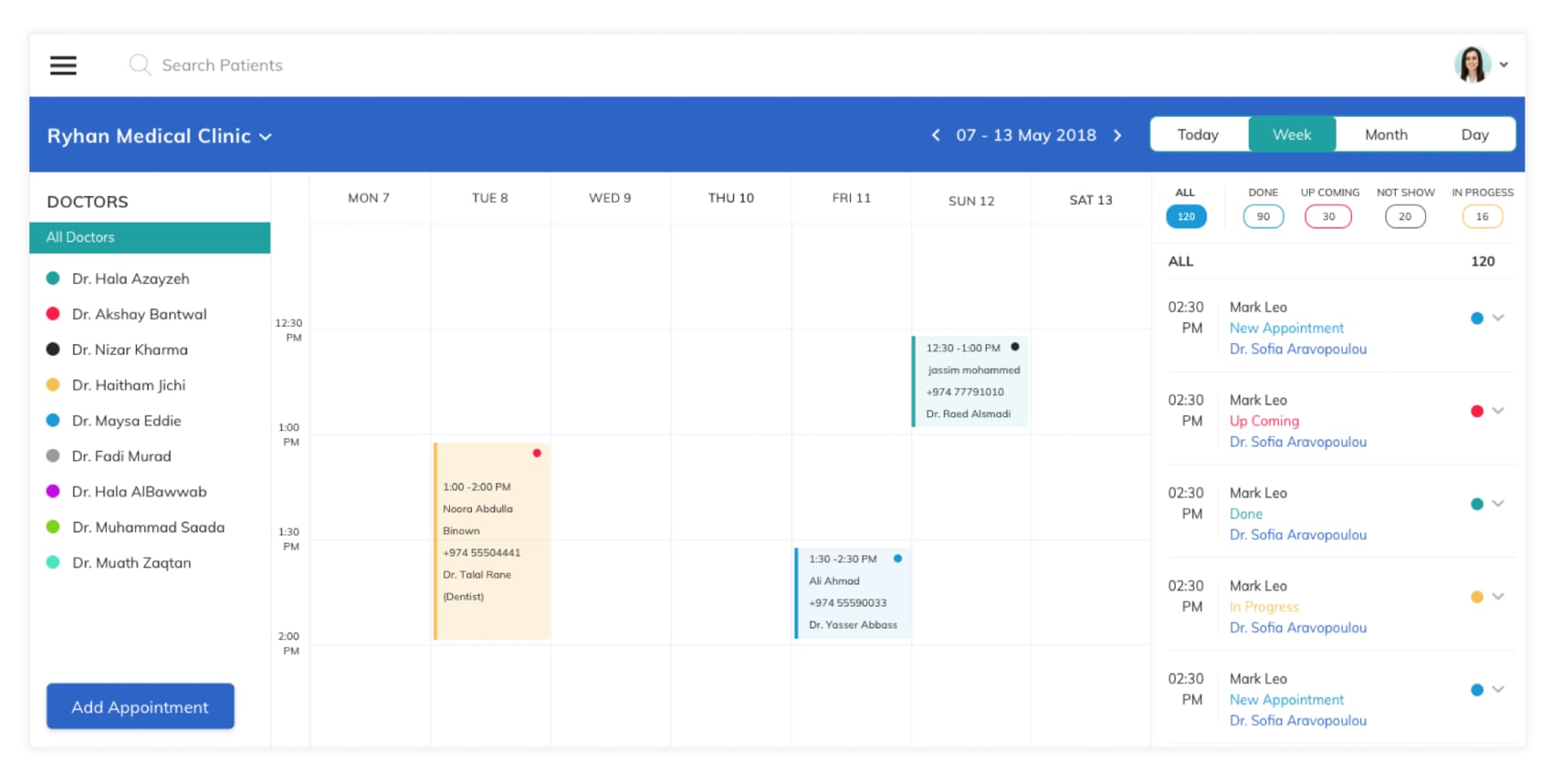
Meddy clinic dashboard showing a weekly appointment calendar with each doctor colour coded and every booking tagged by status

The clinic side of the product. A week of appointments, one colour per doctor, and every booking tagged as new, upcoming, in progress, done or no show. The counts along the top are the number the clinic manager actually cares about, because a no show is money that did not arrive.

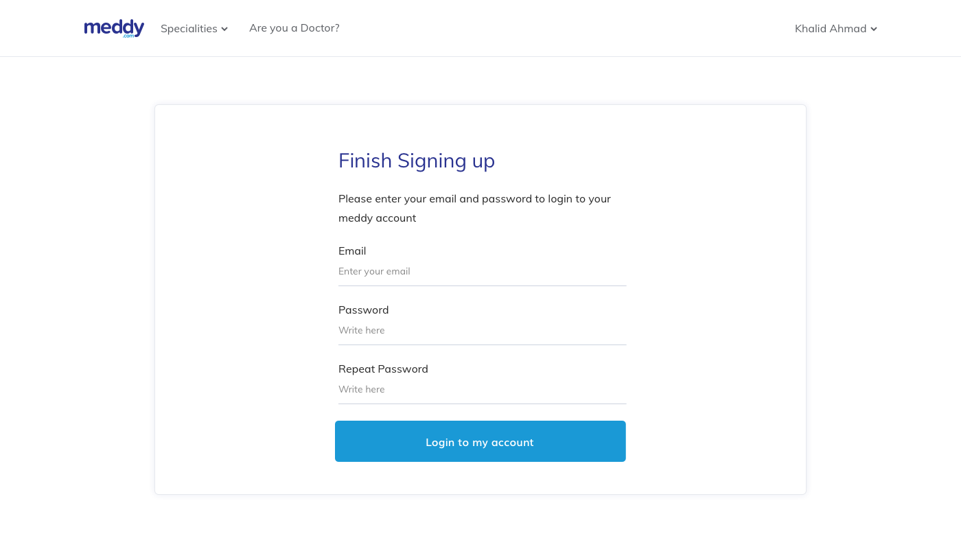
Meddy clinic sign up screen

Signing up a clinic is a negotiation, not a form. The first screen has to answer why this is worth the front desk's time.

The full flow

Every screen, in order.

From the person who ran the company

What Meddy's CEO said about the work.

He always ensured whatever we are building truly solved user needs. He redesigned every aspect of our product that led to massive improvements across engagement and core metrics.

Haris Alghadi CEO of Meddy at the time. Now VP of Product at Calo.

If I built Meddy today

The problem has not changed. The tools have.

Everything above was designed for a system that could not understand a sentence. Here is what I would build now, and none of it is about restyling the screens.

  • Stop asking people to name their own specialtyNobody knows whether they need a gastroenterologist. They know their stomach hurts. The product should ask what is wrong in plain words, ask two or three follow up questions, and then suggest the right doctor. The search box was always the wrong opening question.
  • Cut check in from five steps to a confirmationCheck in had five steps because the system could not guess anything. Today most of that form can be drafted from what the patient has already said, and the patient only checks it and corrects it. Reviewing is much easier than typing, especially when you are unwell.
  • A health profile that builds itself over timeEvery visit, every answer, every follow up should make the next visit shorter. In 2018 every booking started from zero.
  • Escalate the dangerous cases immediately, to a humanIf someone describes symptoms that cannot wait, offering them an appointment in three days is a design failure. The product should put an emergency clinician in front of them right away. To be clear about where the line sits: the model raises the flag, a qualified human makes the call. Getting that boundary right is a design decision as much as a clinical one.

The hard part is still the same one I worked on in 2018. People need a reason to trust the answer, and doctors need to stay in charge of it.

A note on numbers. Meddy was acquired later and I no longer have access to the dashboards from that period, so I have not put any figures on this page myself. The closest thing to a result is above, from the person who was running the company at the time. Everything else here is the reasoning and the work that shipped, and I am happy to walk through any of it in detail.

Working on something in health tech?

I design complex, regulated products where trust is the thing that converts.

Start a conversation
Previous
Previous

Repair-shops Management System ( Arabic SaaS Product )

Next
Next

Dashboard Designs